GAMS MIRO Walkthrough
From GAMSPy Model to GAMS MIRO App
In this tutorial, we will explore the powerful features of GAMS MIRO to generate an application tailored to your optimization problem. Step by step, we will build the MIRO application for this gallery example.
To be able to follow this tutorial, we assume that you have already worked with GAMS or GAMSPy, as we will start with a given GAMSPy model. The content of the first section is GAMSPy specific, everything after that applies to both GAMS and GAMSPy. So if you are working with a GAMS model, you can check the documentation for the syntax, still it might be helpful to follow the tutorial for additional explanations. Otherwise, you just need to have MIRO installed (this tutorial is based on version 2.12.0, if you are using an older version, some of the features we will go through may be missing), and some R knowledge might help in the last part of the tutorial, but is not required. All necessary R functions will be explained, so if you have worked with a similar language before, you are good to go!
As already mentioned, you can start with either a GAMS or a GAMSPy implementation; we’ll be working with a GAMSPy model. Our first step will be to define the application’s inputs and outputs - this is the only part of the process that differs depending on whether you are using GAMS or GAMSPy. After that, the configuration process is the same for both.
We’ll start by showing you how to specify inputs and outputs in your GAMSPy model. Then we will see how to visualize data in MIRO using only these definitions. This step can be extremely helpful during model development: it allows you to quickly plot and inspect the output data to make sure your results make sense. If something doesn’t look right, you have a clear starting point for investigating potential errors in you model implementation.
After we’ve covered the basics of visualization, in the second part of this tutorial we’ll move on to the Configuration Mode. Here you can configure many default settings without editing any code, making it easy to customize your application for different needs. Since built-in options are sometimes not enough, the third part of this tutorial will show you how to add custom renderers and widgets to give you maximum control over the user interface. Finally, we’ll examine advanced customization tips and tricks that can make your MIRO application even more powerful and tailored to your needs.
Implement the Model
The starting point for building your MIRO application is the implementation of your model using either GAMS or GAMSPy. As mentioned, we will be using a GAMSPy model here. If you would like to see how the necessary code modifications would look in GAMS, please refer to the documentation.
Our example model is a “Battery Energy Storage System (BESS) sizing problem,” based on an example from NAG, available on their GitHub (BESS.ipynb). The goal is to optimize a city’s hourly energy schedule by identifying the most cost-effective combination of energy sources, which includes leveraging a BESS to store low-cost energy during off-peak hours and release it when demand is high. By assessing different storage capacities and discharge rates, the model pinpoints the configuration that minimizes overall energy costs while ensuring demand is consistently met.
Before diving in, we recommend that you review the mathematical description in the introduction to the finished application provided in the gallery. We will be referring directly to the variable names introduced there.
GAMSPy model code
import pandas as pd
import sys

from gamspy import (
    Container,
    Alias,
    Equation,
    Model,
    Parameter,
    Sense,
    Set,
    Sum,
    Variable,
    Ord,
    Options,
    ModelStatus,
    SolveStatus,
)


def main():
    m = Container()

    # Generator parameters
    generator_specifications_input = pd.DataFrame(
        [
            ["gen0", 1.1, 220, 50, 100, 4, 2],
            ["gen1", 1.3, 290, 80, 190, 4, 2],
            ["gen2", 0.9, 200, 10, 70, 4, 2],
        ],
        columns=[
            "i",
            "cost_per_unit",
            "fixed_cost",
            "min_power_output",
            "max_power_output",
            "min_up_time",
            "min_down_time",
        ],
    )

    # Load demand to be fulfilled by the energy management system
    # combine with cost external grid, to have one source of truth for the hours (Set j)
    timewise_load_demand_and_cost_external_grid_input = pd.DataFrame(
        [
            ["hour00", 200, 1.5],
            ["hour01", 180, 1.0],
            ["hour02", 170, 1.0],
            ["hour03", 160, 1.0],
            ["hour04", 150, 1.0],
            ["hour05", 170, 1.0],
            ["hour06", 190, 1.2],
            ["hour07", 210, 1.8],
            ["hour08", 290, 2.1],
            ["hour09", 360, 1.9],
            ["hour10", 370, 1.8],
            ["hour11", 350, 1.6],
            ["hour12", 310, 1.6],
            ["hour13", 340, 1.6],
            ["hour14", 390, 1.8],
            ["hour15", 400, 1.9],
            ["hour16", 420, 2.1],
            ["hour17", 500, 3.0],
            ["hour18", 440, 2.1],
            ["hour19", 430, 1.9],
            ["hour20", 420, 1.8],
            ["hour21", 380, 1.6],
            ["hour22", 340, 1.2],
            ["hour23", 320, 1.2],
        ],
        columns=["j", "load_demand", "cost_external_grid"],
    )

    # Set
    i = Set(
        m,
        name="i",
        records=generator_specifications_input["i"],
        description="generators",
    )
    j = Set(
        m,
        name="j",
        records=timewise_load_demand_and_cost_external_grid_input["j"],
        description="hours",
    )
    t = Alias(m, name="t", alias_with=j)

    # Data
    # Generator parameters
    gen_cost_per_unit = Parameter(
        m,
        name="gen_cost_per_unit",
        domain=[i],
        records=generator_specifications_input[["i", "cost_per_unit"]],
        description="cost per unit of generator i",
    )

    gen_fixed_cost = Parameter(
        m,
        name="gen_fixed_cost",
        domain=[i],
        records=generator_specifications_input[["i", "fixed_cost"]],
        description="fixed cost of generator i",
    )

    gen_min_power_output = Parameter(
        m,
        name="gen_min_power_output",
        domain=[i],
        records=generator_specifications_input[["i", "min_power_output"]],
        description="minimal power output of generator i",
    )

    gen_max_power_output = Parameter(
        m,
        name="gen_max_power_output",
        domain=[i],
        records=generator_specifications_input[["i", "max_power_output"]],
        description="maximal power output of generator i",
    )

    gen_min_up_time = Parameter(
        m,
        name="gen_min_up_time",
        domain=[i],
        records=generator_specifications_input[["i", "min_up_time"]],
        description="minimal up time of generator i",
    )

    gen_min_down_time = Parameter(
        m,
        name="gen_min_down_time",
        domain=[i],
        records=generator_specifications_input[["i", "min_down_time"]],
        description="minimal down time of generator i",
    )

    # Battery parameters
    cost_bat_power = Parameter(m, "cost_bat_power", records=1, is_miro_input=True)
    cost_bat_energy = Parameter(m, "cost_bat_energy", records=2, is_miro_input=True)

    # Load demand and external grid
    load_demand = Parameter(
        m, name="load_demand", domain=[j], description="load demand at hour j"
    )

    cost_external_grid = Parameter(
        m,
        name="cost_external_grid",
        domain=[j],
        description="cost of the external grid at hour j",
    )

    max_input_external_grid = Parameter(
        m,
        name="max_input_external_grid",
        records=10,
        description="maximal power that can be imported from the external grid every hour",
    )

    # Variable
    # Generator
    gen_power = Variable(
        m,
        name="gen_power",
        type="positive",
        domain=[i, j],
        description="Dispatched power from generator i at hour j",
    )

    gen_active = Variable(
        m,
        name="gen_active",
        type="binary",
        domain=[i, j],
        description="is generator i active at hour j",
    )

    # Battery
    battery_power = Variable(
        m,
        name="battery_power",
        domain=[j],
        description="power charged or discharged from the battery at hour j",
    )

    battery_delivery_rate = Variable(
        m,
        name="battery_delivery_rate",
        description="power (delivery) rate of the battery energy system",
    )

    battery_storage = Variable(
        m,
        name="battery_storage",
        description="energy (storage) rate of the battery energy system",
    )

    # External grid
    external_grid_power = Variable(
        m,
        name="external_grid_power",
        type="positive",
        domain=[j],
        description="power imported from the external grid at hour j",
    )

    # Equation
    fulfill_load = Equation(
        m,
        name="fulfill_load",
        domain=[j],
        description="load balance needs to be met very hour j",
    )

    gen_above_min_power = Equation(
        m,
        name="gen_above_min_power",
        domain=[i, j],
        description="generators power should be above the minimal output",
    )

    gen_below_max_power = Equation(
        m,
        name="gen_below_max_power",
        domain=[i, j],
        description="generators power should be below the maximal output",
    )

    gen_above_min_down_time = Equation(
        m,
        name="gen_above_min_down_time",
        domain=[i, j],
        description="generators down time should be above the minimal down time",
    )

    gen_above_min_up_time = Equation(
        m,
        name="gen_above_min_up_time",
        domain=[i, j],
        description="generators up time should be above the minimal up time",
    )

    battery_above_min_delivery = Equation(
        m,
        name="battery_above_min_delivery",
        domain=[j],
        description="battery delivery rate (charge rate) above min power rate",
    )

    battery_below_max_delivery = Equation(
        m,
        name="battery_below_max_delivery",
        domain=[j],
        description="battery delivery rate below max power rate",
    )

    battery_above_min_storage = Equation(
        m,
        name="battery_above_min_storage",
        domain=[t],
        description="battery storage above negative energy rate (since negative power charges the battery)",
    )

    battery_below_max_storage = Equation(
        m,
        name="battery_below_max_storage",
        domain=[t],
        description="sum over battery delivery below zero (cant deliver energy that is not stored)",
    )

    external_power_upper_limit = Equation(
        m,
        name="external_power_upper_limit",
        domain=[j],
        description=" input from the external grid is limited",
    )

    fulfill_load[j] = (
        Sum(i, gen_power[i, j]) + battery_power[j] + external_grid_power[j]
        == load_demand[j]
    )

    gen_above_min_power[i, j] = (
        gen_min_power_output[i] * gen_active[i, j] <= gen_power[i, j]
    )

    gen_below_max_power[i, j] = (
        gen_power[i, j] <= gen_max_power_output[i] * gen_active[i, j]
    )

    # if j=0 -> j.lag(1) = 0 which doesn't brake the equation,
    # since generator is of at start, resulting in negative right side, therefore the sum is always above
    gen_above_min_down_time[i, j] = Sum(
        t.where[(Ord(t) >= Ord(j)) & (Ord(t) <= (Ord(j) + gen_min_down_time[i] - 1))],
        1 - gen_active[i, t],
    ) >= gen_min_down_time[i] * (gen_active[i, j.lag(1)] - gen_active[i, j])

    # and for up it correctly starts the check that if its turned on in the first step
    # it has to stay on for the min up time
    gen_above_min_up_time[i, j] = Sum(
        t.where[(Ord(t) >= Ord(j)) & (Ord(t) <= (Ord(j) + gen_min_up_time[i] - 1))],
        gen_active[i, t],
    ) >= gen_min_up_time[i] * (gen_active[i, j] - gen_active[i, j.lag(1)])

    battery_above_min_delivery[j] = -battery_delivery_rate <= battery_power[j]

    battery_below_max_delivery[j] = battery_power[j] <= battery_delivery_rate

    battery_above_min_storage[t] = -battery_storage <= Sum(
        j.where[Ord(j) <= Ord(t)], battery_power[j]
    )

    battery_below_max_storage[t] = Sum(j.where[Ord(j) <= Ord(t)], battery_power[j]) <= 0

    external_power_upper_limit[j] = external_grid_power[j] <= max_input_external_grid

    obj = (
        Sum(
            j,
            Sum(i, gen_cost_per_unit[i] * gen_power[i, j] + gen_fixed_cost[i])
            + cost_external_grid[j] * external_grid_power[j],
        )
        + cost_bat_power * battery_delivery_rate
        + cost_bat_energy * battery_storage
    )

    # Solve
    bess = Model(
        m,
        name="bess",
        equations=m.getEquations(),
        problem="MIP",
        sense=Sense.MIN,
        objective=obj,
    )

    bess.solve(
        solver="CPLEX",
        output=sys.stdout,
        options=Options(equation_listing_limit=1, relative_optimality_gap=0),
    )

    if bess.solve_status not in [
        SolveStatus.NormalCompletion,
        SolveStatus.TerminatedBySolver,
    ] or bess.status not in [ModelStatus.OptimalGlobal, ModelStatus.Integer]:
        print("No solution exists for your input data.\n")
        raise Exception("Infeasible.")

if __name__ == "__main__":
    main()
Model Input
Let’s start by defining some basic inputs. You can see
that we begin with three scalar parameters, each of which
has the additional
is_miro_input=True
option in the definition:
# Battery parameters
cost_bat_power = Parameter(m, "cost_bat_power", records=1, is_miro_input=True)
cost_bat_energy = Parameter(m, "cost_bat_energy", records=2, is_miro_input=True)

# Load demand and external grid
max_input_external_grid = Parameter(
    m,
    name="max_input_external_grid",
    records=10,
    is_miro_input=True,
    description="maximal power that can be imported from the external grid every hour",
)
For the generator specifications and schedule inputs, there are a few extra steps. The model relies on two sets: one for possible generators and another for hours in which load demand must be met. Since these sets are not fixed but should be part of the input, we use Domain Forwarding—an approach where the set is implicitly defined by one parameter.
Because multiple parameters rely on these sets and we want a single source of truth, we need to combine them into a single table in our MIRO application (one for generator specifications, another for the schedule). To achieve this, we define an additional set for the column headers:
generator_spec_header = Set(
    m,
    name="generator_spec_header",
    records=[
        "cost_per_unit",
        "fixed_cost",
        "min_power_output",
        "max_power_output",
        "min_up_time",
        "min_down_time",
    ],
)
We then create a parameter to hold all the relevant information:
generator_specifications = Parameter(
    m,
    name="generator_specifications",
    domain=[i, generator_spec_header],
    domain_forwarding=[True, False],
    records=generator_specifications_input.melt(
        id_vars="i", var_name="generator_spec_header"
    ),
    is_miro_input=True,
    is_miro_table=True,
    description="specifications of each generator",
)
Notice that
is_miro_input=True
makes the parameter an input to the MIRO application,
while
is_miro_table=True
displays the data in
table format. The key detail is
domain_forwarding=[True, False], which ensures that set elements for generators come
from the MIRO application (the header names remain fixed,
hence False). We
still use our initial data to populate these
specifications, but we transform it using
melt()
so that it matches the new format of only two columns:
"i" and
"generator_spec_header".
Since we are now forwarding the domain of set
i through this
table, we no longer specify its records. The same goes
for any parameters that rely on
i (e.g.,
gen_cost_per_unit).
Instead, we assign them by referencing the new combined
parameter:
i = Set(
    m,
    name="i",
-   records=generator_specifications_input["i"],
    description="generators",
)

gen_cost_per_unit = Parameter(
      m,
      name="gen_cost_per_unit",
      domain=[i],
-     records=generator_specifications_input[["i", "cost_per_unit"]],
      description="cost per unit of generator i",
  )

+ gen_cost_per_unit[i] = generator_specifications[i, "cost_per_unit"]
We apply the same pattern to other parameters that depend
on i. Likewise, for
hour-dependent parameters (like
load_demand and
cost_external_grid),
we create a single source of truth for the hour set by
combining them into one parameter and making the same
modifications.
Given the input, we move on to the output.
Model Output
When implementing the model, it can be helpful to flag
variables as outputs by adding
is_miro_output=True.
After solving, we can then view the calculated variable
values right away, making it easier to spot any remaining
model errors.
gen_power = Variable(
    m,
    name="gen_power",
    type="positive",
    domain=[i, j],
    description="dispatched power from generator i at hour j",
    is_miro_output=True,
)
In general, we can designate any variable or parameter as an MIRO output. When implementing the model, it makes sense to simply define all variables as output, so you can easily visualize the results. Sometimes it makes sense to define parameters as outputs that depend on the variables. A straightforward example in our model is to create dedicated parameters for the three cost components, allowing us to display these values directly in the MIRO application:
total_cost_gen = Parameter(
    m,
    "total_cost_gen",
    is_miro_output=True,
    description="total cost of the generators",
)

total_cost_gen[...] = Sum(
    j, Sum(i, gen_cost_per_unit[i] * gen_power.l[i, j] + gen_fixed_cost[i])
)
We apply this same approach for the other power sources and combine them:
Costs for the other power sources
total_cost_battery = Parameter(
    m,
    "total_cost_battery",
    is_miro_output=True,
    description="total cost of the BESS",
)

total_cost_battery[...] = (
    cost_bat_power * battery_delivery_rate.l + cost_bat_energy * battery_storage.l
)

total_cost_extern = Parameter(
    m,
    "total_cost_extern",
    is_miro_output=True,
    description="total cost for the imported power",
)

total_cost_extern[...] = Sum(
    j,
    cost_external_grid[j] * external_grid_power.l[j],
)

total_cost = Parameter(
    m,
    "total_cost",
    is_miro_output=True,
    description="total cost to fulfill the load demand",
)

total_cost[...] = total_cost_gen + total_cost_battery + total_cost_extern
We also combine our power variables with the load demand input into a single output parameter to later show how the sum of all power flows meets the load demand:
# Power output
power_output_header = Set(
    m,
    name="power_output_header",
    records=["battery", "external_grid", "generators", "load_demand"],
)

report_output = Parameter(
    m,
    name="report_output",
    domain=[j, power_output_header],
    description="optimal combination of incoming power flows",
    is_miro_output=True,
)

report_output[j, "generators"] = Sum(i, gen_power.l[i, j])
report_output[j, "battery"] = battery_power.l[j]
report_output[j, "external_grid"] = external_grid_power.l[j]
report_output[j, "load_demand"] = load_demand[j]
Now, we can launch MIRO to see our first fully interactive modeling application!
gamspy run miro --path <path_to_your_MIRO_installation> --model <path_to_your_model>After starting MIRO, the application should look like this:
Effective Data Validation Using Log Files
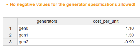
Finally, we will briefly discuss data validation. This is critical to ensuring the accuracy and reliability of optimization models. Log files are key to checking the consistency of input data, and generating reports on inconsistencies helps prevent errors and user frustration. Here we will only verify that our input values are all non-negative. While finding effective validation checks can be challenging, clearly identifying the constraints or values causing infeasibility can significantly improve the user experience.
In MIRO, you have the option to create a custom log file. However, since we are using GAMSPy, we can also directly write to stdout for logging. If we follow the specified MIRO log syntax , any invalid data will be highlighted directly above the corresponding input data sheet in MIRO.
The syntax that must be used for MIRO to jump directly to the table with the incorrect data is as follows:
symbolname:: Error messageTry for yourself how a simple verification of the sign of the input values might look. Keep in mind that you should validate the data before attempting to solve the model. If the validation fails, specify which value caused the failure and raise an exception, as there’s no need to solve the model in this case.
A possible data validation
no_negative_gen_spec = generator_specifications.records[generator_specifications.records["value"] < 0]
no_negative_load = load_demand.records[load_demand.records["value"] < 0]
no_negative_cost = cost_external_grid.records[
    cost_external_grid.records["value"] < 0
]

print(
    """------------------------------------\n       Validating data\n------------------------------------\n"""
)
errors = False

if not no_negative_gen_spec.empty:
    print(
        "generator_specifications:: No negative values for the generator specifications allowed!\n"
    )
    for _, row in no_negative_gen_spec.iterrows():
        print(f'{row["i"]} has a negative value.\n')
    errors = True

if not no_negative_load.empty:
    print(
        "timewise_load_demand_and_cost_external_grid_data:: No negative load demand allowed!\n"
    )
    for _, row in no_negative_load.iterrows():
        print(f'{row["j"]} has negative load demand.\n')
    errors = True

if not no_negative_cost.empty:
    print(
        "timewise_load_demand_and_cost_external_grid_data:: No negative cost allowed!\n"
    )
    for _, row in no_negative_cost.iterrows():
        print(f'{row["j"]} has negative external grid cost.\n')
    errors = True

if errors:
    raise Exception("Data errors detected")
print("Data ok\n")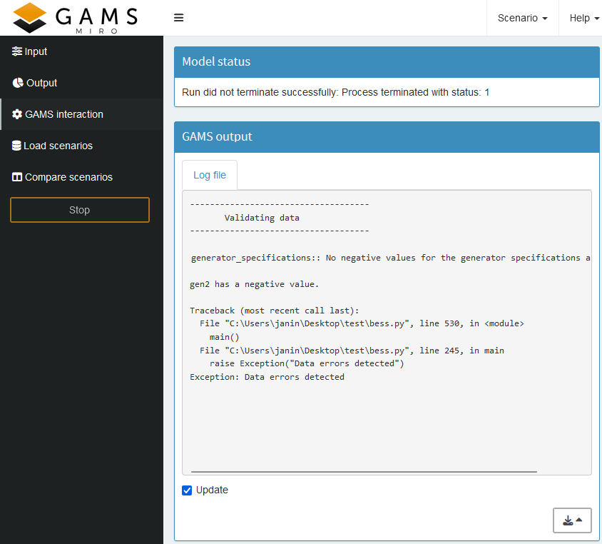
Full updated GAMSPy model
import pandas as pd
import sys

from gamspy import (
    Container,
    Alias,
    Equation,
    Model,
    Parameter,
    Sense,
    Set,
    Sum,
    Variable,
    Ord,
    Options,
    ModelStatus,
    SolveStatus,
)


def main():
    m = Container()

    # Generator parameters
    generator_specifications_input = pd.DataFrame(
        [
            ["gen0", 1.1, 220, 50, 100, 4, 2],
            ["gen1", 1.3, 290, 80, 190, 4, 2],
            ["gen2", 0.9, 200, 10, 70, 4, 2],
        ],
        columns=[
            "i",
            "cost_per_unit",
            "fixed_cost",
            "min_power_output",
            "max_power_output",
            "min_up_time",
            "min_down_time",
        ],
    )

    # Load demand to be fulfilled by the energy management system
    # combine with cost external grid, to have one source of truth for the hours (Set j)
    timewise_load_demand_and_cost_external_grid_input = pd.DataFrame(
        [
            ["hour00", 200, 1.5],
            ["hour01", 180, 1.0],
            ["hour02", 170, 1.0],
            ["hour03", 160, 1.0],
            ["hour04", 150, 1.0],
            ["hour05", 170, 1.0],
            ["hour06", 190, 1.2],
            ["hour07", 210, 1.8],
            ["hour08", 290, 2.1],
            ["hour09", 360, 1.9],
            ["hour10", 370, 1.8],
            ["hour11", 350, 1.6],
            ["hour12", 310, 1.6],
            ["hour13", 340, 1.6],
            ["hour14", 390, 1.8],
            ["hour15", 400, 1.9],
            ["hour16", 420, 2.1],
            ["hour17", 500, 3.0],
            ["hour18", 440, 2.1],
            ["hour19", 430, 1.9],
            ["hour20", 420, 1.8],
            ["hour21", 380, 1.6],
            ["hour22", 340, 1.2],
            ["hour23", 320, 1.2],
        ],
        columns=["j", "load_demand", "cost_external_grid"],
    )

    # Set
    i = Set(
        m,
        name="i",
        description="generators",
    )
    j = Set(
        m,
        name="j",
        description="hours",
    )
    t = Alias(m, name="t", alias_with=j)

    generator_spec_header = Set(
        m,
        name="generator_spec_header",
        records=[
            "cost_per_unit",
            "fixed_cost",
            "min_power_output",
            "max_power_output",
            "min_up_time",
            "min_down_time",
        ],
    )

    timewise_header = Set(
        m, name="timewise_header", records=["load_demand", "cost_external_grid"]
    )

    # Data
    # Generator parameters
    generator_specifications = Parameter(
        m,
        name="generator_specifications",
        domain=[i, generator_spec_header],
        domain_forwarding=[True, False],
        records=generator_specifications_input.melt(
            id_vars="i", var_name="generator_spec_header"
        ),
        is_miro_input=True,
        is_miro_table=True,
        description="Specifications of each generator",
    )

    # To improve readability of the equations we extract the individual columns.
    # Since we want a single source of truth we combine them for MIRO.
    gen_cost_per_unit = Parameter(
        m,
        name="gen_cost_per_unit",
        domain=[i],
        description="cost per unit of generator i",
    )

    gen_fixed_cost = Parameter(
        m, name="gen_fixed_cost", domain=[i], description="fixed cost of generator i"
    )

    gen_min_power_output = Parameter(
        m,
        name="gen_min_power_output",
        domain=[i],
        description="minimal power output of generator i",
    )

    gen_max_power_output = Parameter(
        m,
        name="gen_max_power_output",
        domain=[i],
        description="maximal power output of generator i",
    )

    gen_min_up_time = Parameter(
        m,
        name="gen_min_up_time",
        domain=[i],
        description="minimal up time of generator i",
    )

    gen_min_down_time = Parameter(
        m,
        name="gen_min_down_time",
        domain=[i],
        description="minimal down time of generator i",
    )

    gen_cost_per_unit[i] = generator_specifications[i, "cost_per_unit"]
    gen_fixed_cost[i] = generator_specifications[i, "fixed_cost"]
    gen_min_power_output[i] = generator_specifications[i, "min_power_output"]
    gen_max_power_output[i] = generator_specifications[i, "max_power_output"]
    gen_min_up_time[i] = generator_specifications[i, "min_up_time"]
    gen_min_down_time[i] = generator_specifications[i, "min_down_time"]

    # Battery parameters
    cost_bat_power = Parameter(m, "cost_bat_power", records=1, is_miro_input=True)
    cost_bat_energy = Parameter(m, "cost_bat_energy", records=2, is_miro_input=True)

    # Load demand and external grid
    timewise_load_demand_and_cost_external_grid_data = Parameter(
        m,
        name="timewise_load_demand_and_cost_external_grid_data",
        domain=[j, timewise_header],
        domain_forwarding=[True, False],
        records=timewise_load_demand_and_cost_external_grid_input.melt(
            id_vars="j", var_name="timewise_header"
        ),
        is_miro_input=True,
        is_miro_table=True,
        description="Timeline for load demand and cost of the external grid.",
    )

    load_demand = Parameter(
        m, name="load_demand", domain=[j], description="load demand at hour j"
    )

    cost_external_grid = Parameter(
        m,
        name="cost_external_grid",
        domain=[j],
        description="cost of the external grid at hour j",
    )

    load_demand[j] = timewise_load_demand_and_cost_external_grid_data[j, "load_demand"]
    cost_external_grid[j] = timewise_load_demand_and_cost_external_grid_data[
        j, "cost_external_grid"
    ]

    max_input_external_grid = Parameter(
        m,
        name="max_input_external_grid",
        records=10,
        is_miro_input=True,
        description="maximal power that can be imported from the external grid every hour",
    )

    no_negative_gen_spec = generator_specifications.records[
        generator_specifications.records["value"] < 0
    ]
    no_negative_load = load_demand.records[load_demand.records["value"] < 0]
    no_negative_cost = cost_external_grid.records[
        cost_external_grid.records["value"] < 0
    ]

    print(
        """------------------------------------\n       Validating data\n------------------------------------\n"""
    )
    errors = False

    if not no_negative_gen_spec.empty:
        print(
            "generator_specifications:: No negative values for the generator specifications allowed!\n"
        )
        for _, row in no_negative_gen_spec.iterrows():
            print(f'{row["i"]} has a negative value.\n')
        errors = True

    if not no_negative_load.empty:
        print(
            "timewise_load_demand_and_cost_external_grid_data:: No negative load demand allowed!\n"
        )
        for _, row in no_negative_load.iterrows():
            print(f'{row["j"]} has negative load demand.\n')
        errors = True

    if not no_negative_cost.empty:
        print(
            "timewise_load_demand_and_cost_external_grid_data:: No negative cost allowed!\n"
        )
        for _, row in no_negative_cost.iterrows():
            print(f'{row["j"]} has negative external grid cost.\n')
        errors = True

    if errors:
        raise Exception("Data errors detected")
    print("Data ok\n")

    # Variable
    # Generator
    gen_power = Variable(
        m,
        name="gen_power",
        type="positive",
        domain=[i, j],
        description="Dispatched power from generator i at hour j",
        is_miro_output=True,
    )

    gen_active = Variable(
        m,
        name="gen_active",
        type="binary",
        domain=[i, j],
        description="is generator i active at hour j",
    )

    # Battery
    battery_power = Variable(
        m,
        name="battery_power",
        domain=[j],
        description="power charged or discharged from the battery at hour j",
        is_miro_output=True,
    )

    battery_delivery_rate = Variable(
        m,
        name="battery_delivery_rate",
        description="power (delivery) rate of the battery energy system",
        is_miro_output=True,
    )

    battery_storage = Variable(
        m,
        name="battery_storage",
        description="energy (storage) rate of the battery energy system",
        is_miro_output=True,
    )

    # External grid
    external_grid_power = Variable(
        m,
        name="external_grid_power",
        type="positive",
        domain=[j],
        description="power imported from the external grid at hour j",
        is_miro_output=True,
    )

    # Equation
    fulfill_load = Equation(
        m,
        name="fulfill_load",
        domain=[j],
        description="load balance needs to be met very hour j",
    )

    gen_above_min_power = Equation(
        m,
        name="gen_above_min_power",
        domain=[i, j],
        description="generators power should be above the minimal output",
    )

    gen_below_max_power = Equation(
        m,
        name="gen_below_max_power",
        domain=[i, j],
        description="generators power should be below the maximal output",
    )

    gen_above_min_down_time = Equation(
        m,
        name="gen_above_min_down_time",
        domain=[i, j],
        description="generators down time should be above the minimal down time",
    )

    gen_above_min_up_time = Equation(
        m,
        name="gen_above_min_up_time",
        domain=[i, j],
        description="generators up time should be above the minimal up time",
    )

    battery_above_min_delivery = Equation(
        m,
        name="battery_above_min_delivery",
        domain=[j],
        description="battery delivery rate (charge rate) above min power rate",
    )

    battery_below_max_delivery = Equation(
        m,
        name="battery_below_max_delivery",
        domain=[j],
        description="battery delivery rate below max power rate",
    )

    battery_above_min_storage = Equation(
        m,
        name="battery_above_min_storage",
        domain=[t],
        description="battery storage above negative energy rate (since negative power charges the battery)",
    )

    battery_below_max_storage = Equation(
        m,
        name="battery_below_max_storage",
        domain=[t],
        description="sum over battery delivery below zero (cant deliver energy that is not stored)",
    )

    external_power_upper_limit = Equation(
        m,
        name="external_power_upper_limit",
        domain=[j],
        description=" input from the external grid is limited",
    )

    fulfill_load[j] = (
        Sum(i, gen_power[i, j]) + battery_power[j] + external_grid_power[j]
        == load_demand[j]
    )

    gen_above_min_power[i, j] = (
        gen_min_power_output[i] * gen_active[i, j] <= gen_power[i, j]
    )

    gen_below_max_power[i, j] = (
        gen_power[i, j] <= gen_max_power_output[i] * gen_active[i, j]
    )

    # if j=0 -> j.lag(1) = 0 which doesn't brake the equation,
    # since generator is of at start, resulting in negative right side, therefore the sum is always above
    gen_above_min_down_time[i, j] = Sum(
        t.where[(Ord(t) >= Ord(j)) & (Ord(t) <= (Ord(j) + gen_min_down_time[i] - 1))],
        1 - gen_active[i, t],
    ) >= gen_min_down_time[i] * (gen_active[i, j.lag(1)] - gen_active[i, j])

    # and for up it correctly starts the check that if its turned on in the first step
    # it has to stay on for the min up time
    gen_above_min_up_time[i, j] = Sum(
        t.where[(Ord(t) >= Ord(j)) & (Ord(t) <= (Ord(j) + gen_min_up_time[i] - 1))],
        gen_active[i, t],
    ) >= gen_min_up_time[i] * (gen_active[i, j] - gen_active[i, j.lag(1)])

    battery_above_min_delivery[j] = -battery_delivery_rate <= battery_power[j]

    battery_below_max_delivery[j] = battery_power[j] <= battery_delivery_rate

    battery_above_min_storage[t] = -battery_storage <= Sum(
        j.where[Ord(j) <= Ord(t)], battery_power[j]
    )

    battery_below_max_storage[t] = Sum(j.where[Ord(j) <= Ord(t)], battery_power[j]) <= 0

    external_power_upper_limit[j] = external_grid_power[j] <= max_input_external_grid

    obj = (
        Sum(
            j,
            Sum(i, gen_cost_per_unit[i] * gen_power[i, j] + gen_fixed_cost[i])
            + cost_external_grid[j] * external_grid_power[j],
        )
        + cost_bat_power * battery_delivery_rate
        + cost_bat_energy * battery_storage
    )

    # Solve
    bess = Model(
        m,
        name="bess",
        equations=m.getEquations(),
        problem="MIP",
        sense=Sense.MIN,
        objective=obj,
    )

    bess.solve(
        solver="CPLEX",
        output=sys.stdout,
        options=Options(equation_listing_limit=1, relative_optimality_gap=0),
    )

    if bess.solve_status not in [
        SolveStatus.NormalCompletion,
        SolveStatus.TerminatedBySolver,
    ] or bess.status not in [ModelStatus.OptimalGlobal, ModelStatus.Integer]:
        print("No solution exists for your input data.\n")
        raise Exception("Infeasible.")

    # Extract the output data

    # Power output
    power_output_header = Set(
        m,
        name="power_output_header",
        records=["battery", "external_grid", "generators", "load_demand"],
    )

    report_output = Parameter(
        m,
        name="report_output",
        domain=[j, power_output_header],
        description="Optimal combination of incoming power flows",
        is_miro_output=True,
    )

    report_output[j, "generators"] = Sum(i, gen_power.l[i, j])
    report_output[j, "battery"] = battery_power.l[j]
    report_output[j, "external_grid"] = external_grid_power.l[j]
    report_output[j, "load_demand"] = load_demand[j]

    # Costs
    total_cost_gen = Parameter(
        m,
        "total_cost_gen",
        is_miro_output=True,
        description="Total cost of the generators",
    )

    total_cost_gen[...] = Sum(
        j, Sum(i, gen_cost_per_unit[i] * gen_power.l[i, j] + gen_fixed_cost[i])
    )

    total_cost_battery = Parameter(
        m,
        "total_cost_battery",
        is_miro_output=True,
        description="Total cost of the BESS",
    )

    total_cost_battery[...] = (
        cost_bat_power * battery_delivery_rate.l + cost_bat_energy * battery_storage.l
    )

    total_cost_extern = Parameter(
        m,
        "total_cost_extern",
        is_miro_output=True,
        description="Total cost for the imported power",
    )

    total_cost_extern[...] = Sum(
        j,
        cost_external_grid[j] * external_grid_power.l[j],
    )

    total_cost = Parameter(
        m,
        "total_cost",
        is_miro_output=True,
        description="Total cost to fulfill the load demand",
    )

    total_cost[...] = total_cost_gen + total_cost_battery + total_cost_extern

if __name__ == "__main__":
    main()
Key Takeaways
-
Interactive Inputs and Outputs:
Marking parameters as
is_miro_inputoris_miro_outputenables dynamic fields for data input and real-time feedback, enhancing flexibility and debugging. - Rapid Prototyping: Define output parameters based on variables to summarize important information such as cost. Then visually inspect the output to catch problems early!
- Data Validation and Error Reporting: Ensuring input consistency through log files and custom error messages (via MIRO syntax) helps catch errors early and improves user experience by highlighting inconsistencies directly in the input data sheets.
Basic Application - Rapid Prototyping
Now that we have our first MIRO application, let’s explore the types of interaction we get right out of the box.
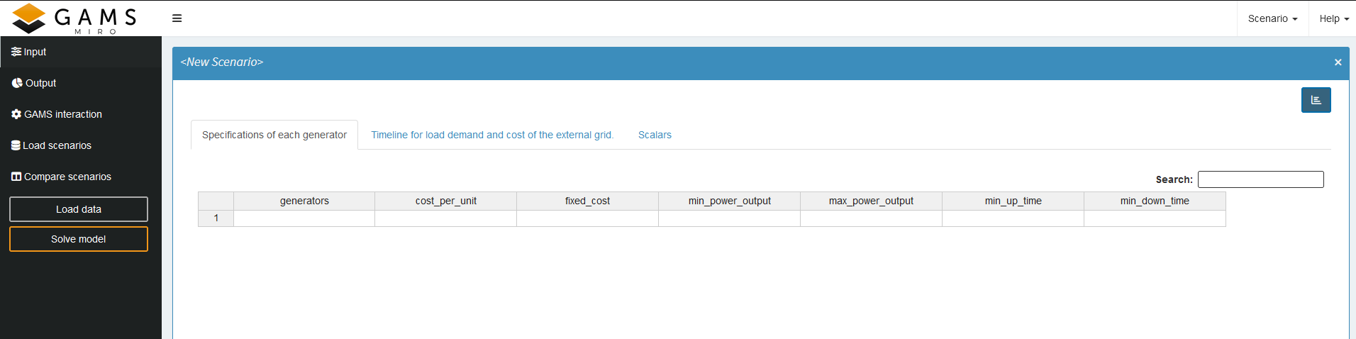
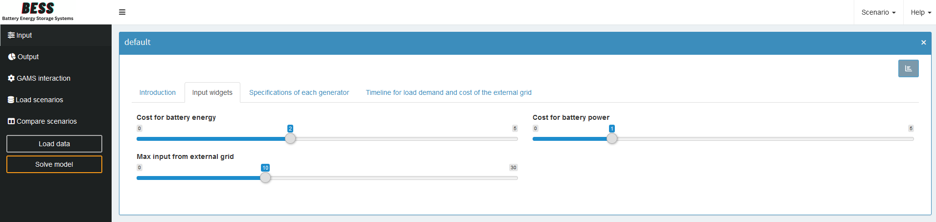
Input
At first the input parameters are empty. By clicking on Load data, we can load the default values defined by the records option in our GAMSPy code.
If our input parameters are correctly set up, we can modify them and then click Solve model to compute solutions for new input values.
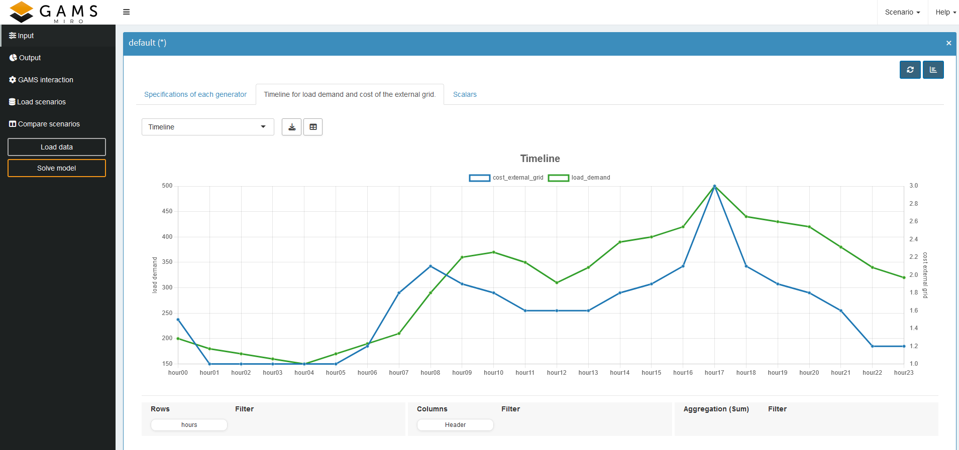
Even before solving, it can sometimes be useful to
visualize the data to catch inconsistencies—such as
negative load demand (which shouldn’t happen) or cost
values that don’t align with expectations throughout the
day. To view this data graphically, we can toggle the
chart view in the top-right corner by clicking the
![]() icon. Here, we can filter, aggregate, and pivot the data.
We can also use different chart types directly through
the
Pivot Table.
icon. Here, we can filter, aggregate, and pivot the data.
We can also use different chart types directly through
the
Pivot Table.
In our example, we pivoted the headers and selected line
graphs. Because the dimensions of
load_demand and
cost_external_grid
differ, it initially looks as though
cost_external_grid
is zero, even though it isn’t. To clarify this, we add a
second y-axis with a different scale:
- Switch the display type to Line Chart.
-
Click the
 icon to add a new view.
- In the Second Axis tab, pick which series should use the additional y-axis.
- (Optional) Add a title and label for the axis.
- Save the view.
-
Press the
 icon to enable
Presentation Mode.
icon to enable
Presentation Mode.
You should end up with something like this:
Output
When implementing the model, the output is often more interesting than the input, so let’s see what we can do here.
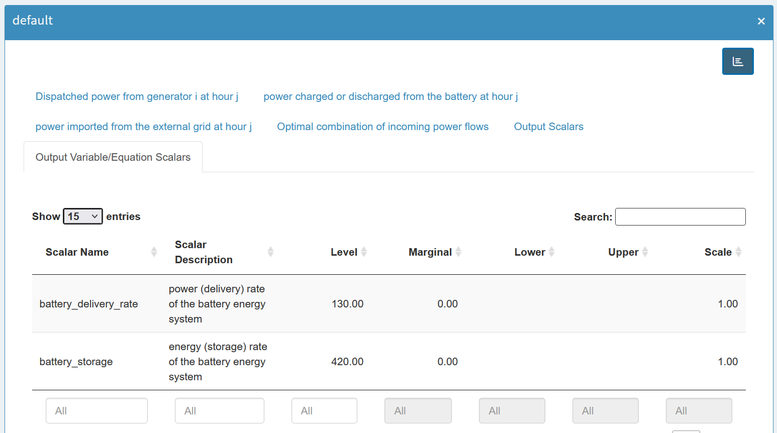
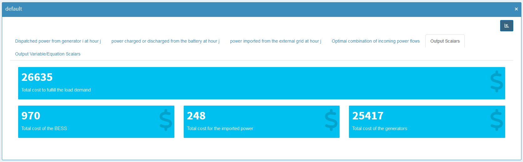
MIRO separates scalar outputs into scalar parameters and scalar variables/equations:
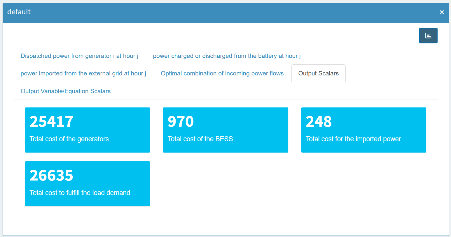
As you can see, for scalar variables it contains not only
the value of the scalar (level), but also
marginal,
lower,
upper and
scale. And since
scalar parameters don’t have these attributes, they are
treated separately.
For multi-dimensional output variables, we can again use the Pivot tool. For example, suppose we want to see how much power each generator is supplying at any given time. We can open the output variable containing the power values of the generators, pivot by generator, and filter by the `level’ value. Next, we select the Stacked Bar Chart option, which gives us this view:
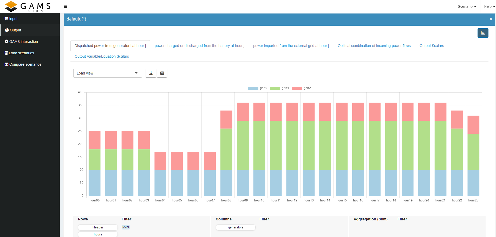
We can see that gen1 is the most expensive generator. It is used a bit at the beginning, then it is turned off after its minimum up time of four hours. And after another four hours it is turned on again, which also fulfills the minimum down time. As you can see, gen0 is the cheapest in both unit and fixed costs, so it is always at full power. All in all, we see that the minimum uptime and downtime constraints are met, and that each active generator stays within its power limits. If any of these constraints were violated, we would know exactly which part of the model to revisit.
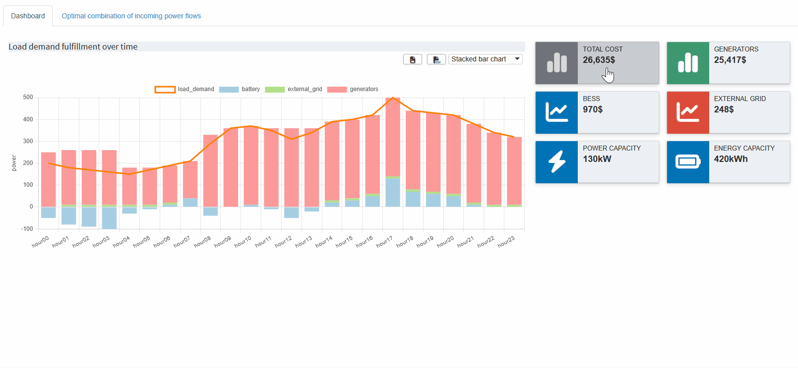
Let’s look at another example. Recall that we combined all power values with the given load demand into a single parameter so we could verify if the load demand is indeed met and how each source contributes at each hour. If we chose a Stacked Bar Chart, we can not easily compare the load demand with the sum of the power sources. Instead, we:
- Select Stacked Bar Chart.
-
Click the
icon to add a new view.
- In the Combo Chart tab, specify that the load demand should be shown as a Line and excluded from the stacked bars.
- Save the view.
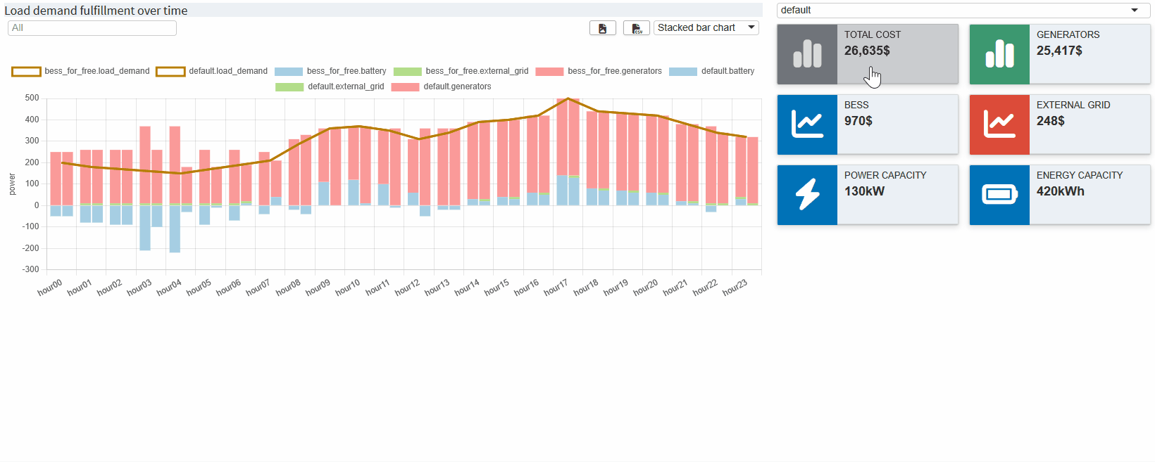
The result should look like this:
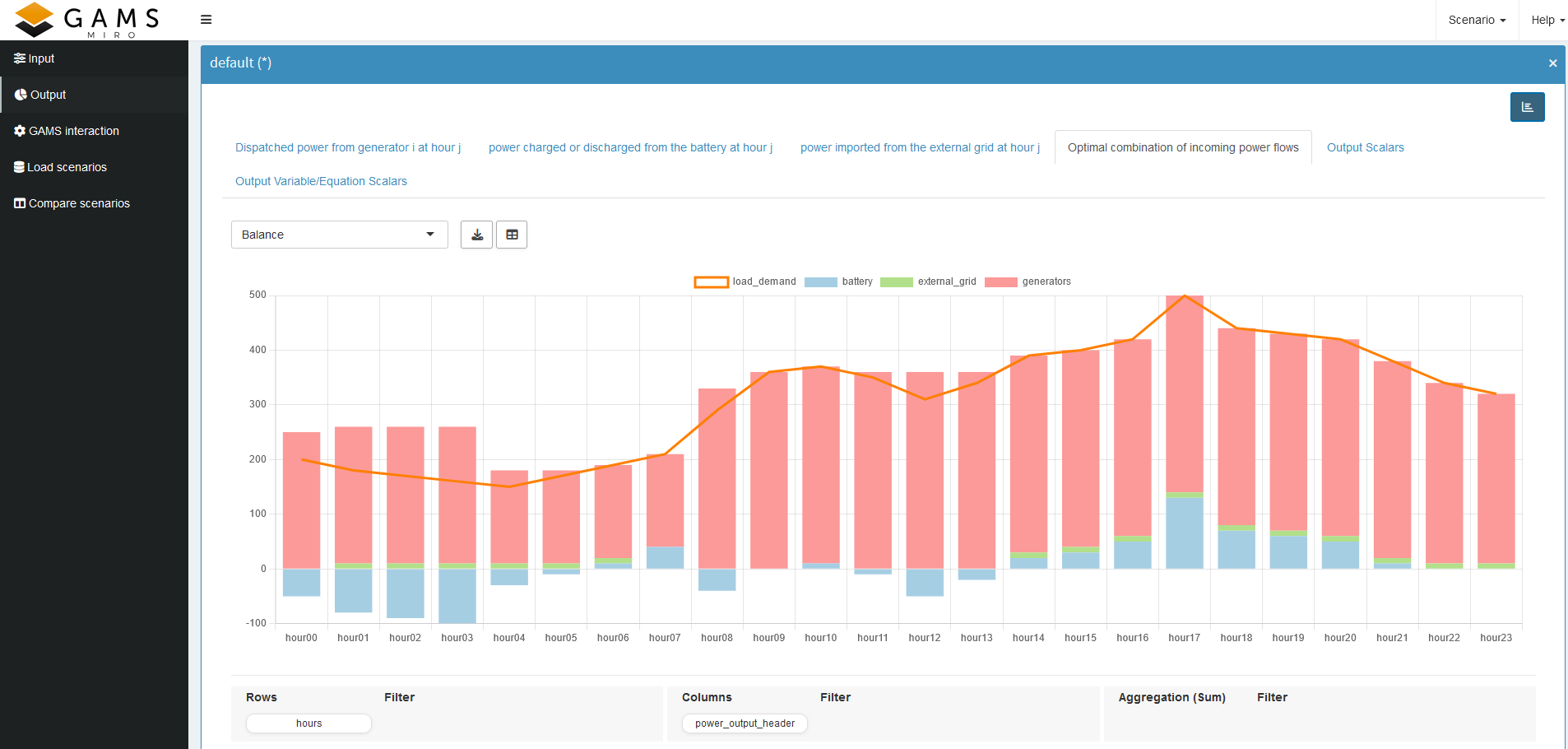
Here, we can immediately confirm that the load demand is always satisfied—except when the BESS is being charged, which is shown by the negative part of the blue bar. This is another good indication that our constraints are working correctly.
We can create similar visualizations for battery power or external grid power to ensure their constraints are also satisfied. By now, you should have a better grasp of the powerful pivot tool in MIRO and how to use it to check your model implementation on the fly.
Key Takeaways
- Visual Validation: Pivot tables and charts in MIRO allow you to quickly verify your constraints.
- Logical Insights: For example, use stacked bar or line graphs to show whether demand is being met, or which generator combination is the cheapest.
Now that we have our first MIRO application and a better understanding of our optimization model, in the next part we will look at the Configuration Mode, where you can customize your application without writing any code!
Configuration Mode
In the last part we went from a GAMSPy model to a first basic GAMS MIRO application for this gallery example. Now that we have a better understanding of our model and are confident that it satisfies the given constraints while providing a reasonable solution, we can begin to configure our application.
To do this, we will start our MIRO application in Configuration Mode.
gamspy run miro --mode="config" --path <path_to_your_MIRO_installation> --model <path_to_your_model>You should see the following:
The Configuration Mode gives us access to a wealth of out-of-the-box customization options, so we don’t need to write any code for now.
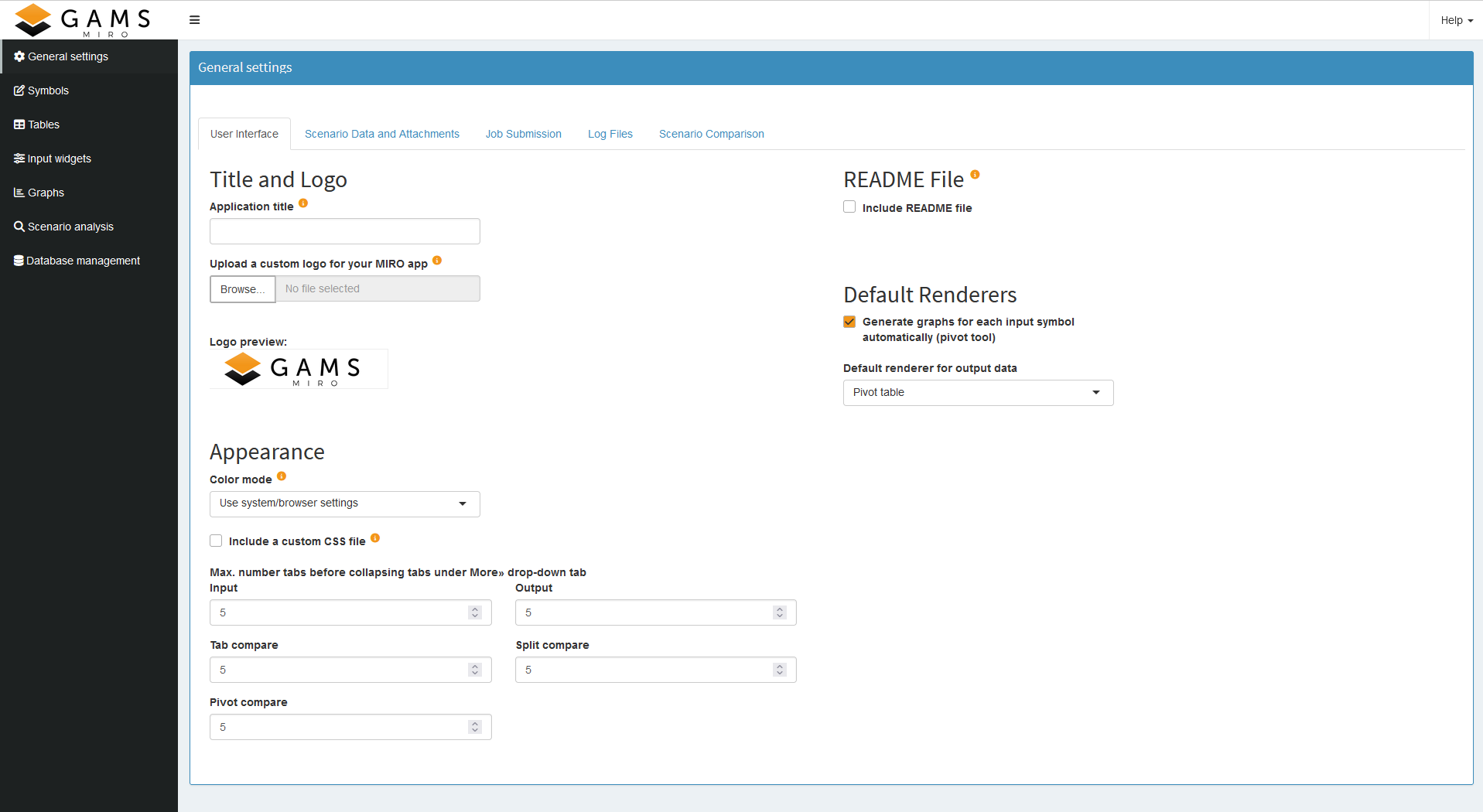
General Settings
Let’s start by adjusting some general settings. We can give our application a title, add a logo, include a README, and enable loading the default scenario at startup. These are just a few of the available options. If your company has a specific CSS style, you could include it here as well. For the complete list of settings, see the General settings documentation.
Symbols
Next, we move to the Symbols section. First, we change our symbol aliases to something more intuitive. Then, assuming we might want to tweak scalar inputs often, we change the order in which the input symbols appear. Finally, in some cases, we need to mark variables or parameters as outputs only so we can use them in a custom renderer (we’ll introduce custom renderers in the next part). If such outputs are solely for backend use, we might hide them to avoid cluttering the output section.

Tables
In the Tables section, we can customize the general configuration of input and output tables. In our example, this is optional—our current settings work well enough.
Input Widgets
Input widgets are all items that communicate input data with the model. We have several inputs and we will customize them in the Input Widgets section. Let’s take a look at our scalar inputs first. We can choose between sliders, drop down menus, checkboxes, or numeric inputs. Here, we’ll set them to sliders. If we don’t want to impose any restrictions on the value (minimum, maximum and increment), we would stay with numeric inputs. The best choice depends on the nature of the input data.
For our multidimensional inputs, tables are the only direct option in Configuration Mode. We can pick from three table types. Because our current datasets are relatively small and we don’t plan significant editing, we’ll stick with the default table. If we anticipate working with massive datasets, switching to the performance-optimized Big Data Table is wise. If you know you will be doing a lot of data slicing in your table, you should choose the Pivot Table. For more details on table types, see the documentation.
If these three table types aren’t sufficient for your needs, you can build a custom widget—a process we’ll see in the next part.
Graphs
Finally, let’s explore the Graphs. This is where we can experiment with data visualization. For every multidimensional symbol (input or output), we can define a default visualization. We can choose from the most common plot types or use the Pivot Table again, which we used during rapid prototyping. If we’ve already created useful views, we can now set them as defaults so that anyone opening the application immediately sees the relevant charts.
We won’t cover every possibility here because we looked at the Pivot tool in detail earlier. However, let’s check out a small example using value boxes for our output. First, we select a scenario (currently, only the default scenario is available). Then we pick the GAMS symbol *_scalars_out: Output Scalars* and choose the charting type Valuebox for scalar values. From there, we can specify the order of the value boxes, their colors, and units. After clicking Save, we launch the application in Base Mode and see something like this:
We can also add the views we set up in the previous section.
If you are looking for something specific, check out the documentation, which provides an extensive guide to all available plot types.
Each change we make in the Configuration Mode is automatically saved to <model_name>.json. In the documentation you will find the corresponding json snippets you would need to add, but don't worry, this is exactly what the Configuration Mode does when you save a graph!
Finally, in the Charting Type drop down menu you will also find the Custom Renderer option, which we will talk about in the next part.
Scenario analysis
MIRO has several build-in scenario comparison modes that allow to compare the input and/or output data of different model runs. While most compare modes are available out of the box, you can enable a dashboard for scenario data comparison with some app-specific configuration. We will introduce the dashboard compare in the next section. The process for setting this up will be explained after the regular dashboard renderer is introduced.
Database management
Finally the Configuration Mode also allows you to backup, remove or restore a database.
Since all these configurations do not take much time, this could be your first draft for your management. Now they can get an idea of what the final product might look like, and you can go deeper and add any further customizations you need. How to do this is explained in the next part.
Key Takeaways
- Simple Customization: Change chart defaults, rename symbols, and customize input widgets all from a single interface.
- Presentation-Ready: Save preferred views so end users see the best visualizations right away.
Dashboard
You may have already noticed the Dashboard option in the Graphs section of the MIRO documentation. If we have several saved views - perhaps some combined with Key Performance Indicators (KPIs) - a dashboard can provide an organized overview of our application output.
Creating a dashboard is not directly possible from Configuration Mode. Instead, we need to edit our <model_name>.json file. To add a dashboard, we will follow the explanation in the documentation. Here we will only discuss the parts we use, for more information check the documentation.
Before we modify the JSON file, we need to decide how we want the final dashboard to look. Specifically, we should choose: 1. Value Boxes (Tiles): Which scalar values we want to highlight, and whether they serve as KPIs. 2. Associated Views: Which views will be linked to each value box. Most likely, we can reuse the views we created earlier.
We find our
<model_name>.json file in
the
conf_ <model_name>
directory. Here, we look for the
dataRendering key—or
define it if it doesn’t exist (it won’t, if you followed
this tutorial). We need to pick an output symbol to serve
as our main parameter, but the choice isn’t critical—we
can add other symbols later as needed. We just can’t have
another renderer for this specific symbol if we choose to
have more output tabs than just the dashboard.
For this example, we’ll choose
"_scalarsve_out". This
symbol contains all scalar output values of variables and
equations. Because we probably won’t create an individual
renderer for them, it’s a convenient symbol choice for
our dashboard.
Getting more specific, in bess.json we now need to configure three things:
- The value boxes and whether they should display a scalar value (KPI).
- Which data view corresponds to which value box and which charts/tables it will contain.
- The individual charts/tables.
Here’s the basic layout of our dashboard configuration
for the symbol
"_scalarsve_out":
{
  "dataRendering": {
    "_scalarsve_out": {
      "outType": "dashboard",
      "additionalData": [],
      "options": {
        "valueBoxesTitle": "",
        "valueBoxes": {
            ...
        },
        "dataViews": {
            ...
        },
        "dataViewsConfig": {
            ...
        }
      }
    }
  },
}
If we already had other renderers, they would appear
under dataRendering as
well, we’ll add ours in the next section.
To keep the code snippets concise, we will only look at the options we changed and have the full json at the end.
Adding Additional Data
Usually, we don’t immediately know every dataset we need.
In this tutorial, however, we already plan to use
"report_output",
"gen_power",
"battery_power"
and
"external_grid_power"
since we already have an idea of which views we want to
display. But of course you can add or remove symbols at
any time. Further we will add the input symbol
"generator_specifications"
to easily check if the generator characteristic are
fulfilled. All needed symbols are added to
"additionalData":
"additionalData": ["report_output", "gen_power", "battery_power", "external_grid_power", "generator_specifications"]
Value Boxes
In the options we can first add a title for the value boxes.
"valueBoxesTitle": "Summary indicators",
Let’s create six value boxes in total, but we’ll only
discuss the first two in detail. Try adding the others
for the ids:
"battery_power",
"external_grid_power",
"battery_delivery_rate"
and
"battery_storage".
Each value box needs:
- A unique id (to link it to a corresponding data view, if any).
-
An optional scalar parameter as KPI. If you don’t have
a matching KPI, but still want to have the view in the
dashboard, just set it to
null. - Style parameters (see the value box documentation for more information).
"valueBoxes": {
    "color": ["black", "olive"],
    "decimals": [2, 2],
    "icon": ["chart-simple", "chart-simple"],
    "id": ["total_cost", "gen_power"],
    "noColor": [true, true],
    "postfix": ["$", "$"],
    "prefix": ["", ""],
    "redPositive": [false, false],
    "title": ["Total Cost", "Generators"],
    "valueScalar": ["total_cost", "total_cost_gen"]
}
Click to see the code for all six boxes
"valueBoxes": {
    "color": ["black", "olive", "blue", "red", "blue", "blue"],
    "decimals": [2, 2, 2, 2, 2, 2],
    "icon": ["chart-simple", "chart-simple", "chart-line", "chart-line", "bolt", "battery-full"],
    "id": ["total_cost", "gen_power", "battery_power", "external_grid_power", "battery_delivery_rate", "battery_storage"],
    "noColor": [true, true, true, true, true, true],
    "postfix": [ "$", "$", "$", "$", "kW", "kWh"],
    "prefix": ["", "", "", "", "",  ""],
    "redPositive": [ false, false, false, false, false, false],
    "title": ["Total Cost", "Generators", "BESS", "External Grid", "Power Capacity", "Energy Capacity"],
    "valueScalar": ["total_cost", "total_cost_gen", "total_cost_battery", "total_cost_extern", "battery_delivery_rate", "battery_storage"]
}
Data Views
Next, under
"dataViews", we define
which charts or tables belong to each value box. A data
view is displayed when the corresponding value box is
clicked on in the dashboard. Multiple charts and tables
can be displayed. We only connect data views to the first
four value boxes, leaving the last two without any
dedicated view. This is done by simply not specifying a
data view for those id’s.
The key of a data view (e.g. "battery_power") must match the id of a value box in
"valueBoxes". We start
each data view with the
id from the
corresponding value box, then we assign a list of objects
to it. Each object within the list has a key (e.g.,
"BatteryTimeline")
that references a chart or table we will define next in
"dataViewsConfig", and
as value we assign the optional title that will be
displayed above the view in the dashboard. If you want to
have more than one chart/table in a view, just add a
second element to the object, as is done for
"gen_power".
"dataViews": {
    "battery_power": [
        {"BatteryTimeline": "Charge/Discharge of the BESS"}
    ],
    "external_grid_power": [
        {"ExternalTimeline": "Power taken from the external grid"}
    ],
    "gen_power": [
        {"GeneratorTimeline": "Generators Timeline"},
        {"GeneratorSpec": ""}
    ],
    "total_cost": [
        {"Balance": "Load demand fulfillment over time"}
    ]
}
Configuring Charts and Tables
The only thing left to do is to specify the actual
charts/tables to be displayed. This is also explained in
detail in the
documentation. The easiest way to add charts/tables is: 1. Create
views in the application via the pivot tool. 2. Save
these views. 3. Download the JSON configuration for the
views (via Scenario (top right corner of the
application) -> Edit metadata ->
View). 4. Copy the JSON configuration to the
"dataViewsConfig"
section. Most of the configuration can be copied
directly. We just need to change the way we define which
symbol the view is based on. It is no longer defined
outside, but we will add
"data: "report_output"
to specify the symbol, otherwise MIRO will base the view
on
"_scalarsve_out" since
that is the variable the renderer is based on.
{
-  "report_output": {
    "Balance": {
      ...
+     "data": "report_output",
      ...
    }
-  }
}
The complete configuration in
"dataViewsConfig"
looks like this:
Click to see the code for all four views
"dataViewsConfig": {
    "Balance": {
        "aggregationFunction": "sum",
        "chartOptions": {
            "multiChartOptions": {
                "multiChartRenderer": "line",
                "multiChartStepPlot": false,
                "showMultiChartDataMarkers": false,
                "stackMultiChartSeries": "no"
            },
            "multiChartSeries": "load_demand",
            "showXGrid": true,
            "showYGrid": true,
            "singleStack": false,
            "yLogScale": false,
            "yTitle": "power"
        },
        "cols": {
            "power_output_header": null
        },
        "data": "report_output",
        "domainFilter": {
            "default": null
        },
        "pivotRenderer": "stackedbar",
        "rows": "j",
        "tableSummarySettings": {
            "colSummaryFunction": "sum",
            "enabled": false,
            "rowSummaryFunction": "sum"
        }
    },
    "BatteryTimeline": {
        "aggregationFunction": "sum",
        "chartOptions": {
            "showDataMarkers": true,
            "showXGrid": true,
            "showYGrid": true,
            "stepPlot": false,
            "yLogScale": false,
            "yTitle": "power"
        },
        "data": "battery_power",
        "domainFilter": {
            "default": null
        },
        "filter": {
            "Hdr": "level"
        },
        "pivotRenderer": "line",
        "rows": "j",
        "tableSummarySettings": {
            "colEnabled": false,
            "colSummaryFunction": "sum",
            "rowEnabled": false,
            "rowSummaryFunction": "sum"
        }
    },
    "ExternalTimeline": {
        "aggregationFunction": "sum",
        "chartOptions": {
            "showDataMarkers": true,
            "showXGrid": true,
            "showYGrid": true,
            "stepPlot": false,
            "yLogScale": false,
            "yTitle": "power"
        },
        "data": "external_grid_power",
        "domainFilter": {
            "default": null
        },
        "filter": {
            "Hdr": "level"
        },
        "pivotRenderer": "line",
        "rows": "j",
        "tableSummarySettings": {
            "colEnabled": false,
            "colSummaryFunction": "sum",
            "rowEnabled": false,
            "rowSummaryFunction": "sum"
        }
    },
    "GeneratorSpec": {
      "aggregationFunction": "sum",
      "pivotRenderer": "table",
      "domainFilter": {
          "default": null
      },
      "tableSummarySettings": {
          "rowEnabled": false,
          "rowSummaryFunction": "sum",
          "colEnabled": false,
          "colSummaryFunction": "sum"
      },
      "data": "generator_specifications",
      "rows":"i",
      "cols": {"Hdr": null}
    },
    "GeneratorTimeline": {
        "aggregationFunction": "sum",
        "chartOptions": {
            "showXGrid": true,
            "showYGrid": true,
            "singleStack": false,
            "yLogScale": false,
            "yTitle": "power"
        },
        "cols": {
            "i": null
        },
        "data": "gen_power",
        "domainFilter": {
            "default": null
        },
        "filter": {
            "Hdr": "level"
        },
        "pivotRenderer": "stackedbar",
        "rows": "j",
        "tableSummarySettings": {
            "colEnabled": false,
            "colSummaryFunction": "sum",
            "rowEnabled": false,
            "rowSummaryFunction": "sum"
        }
    }
}
Finally, we end up with this dashboard:
Now that we've combined multiple outputs into a single
dashboard, it makes sense to hide the tabs for the
individual output symbols and rename the dashboard tab
for clarity (in the config mode). Just a heads up, you
should keep
"report_output", we
will add a custom renderer for it in the next part.
It is also possible to add custom code to the dashboard. However, since this requires a bit more effort and you need to know how to create a custom renderer in the first place, we will leave this for the next part.
Dashboard Comparison
As mentioned before, MIRO provides three built-in scenario comparison modes, accessible under the Compare scenarios tab. The Split view comparison mode displays two scenarios side by side, showing all configured renderers for both input and output symbols—this includes the previously created dashboard. As an example, we will compare our default setting with a scenario where we set the cost of BESS to zero:
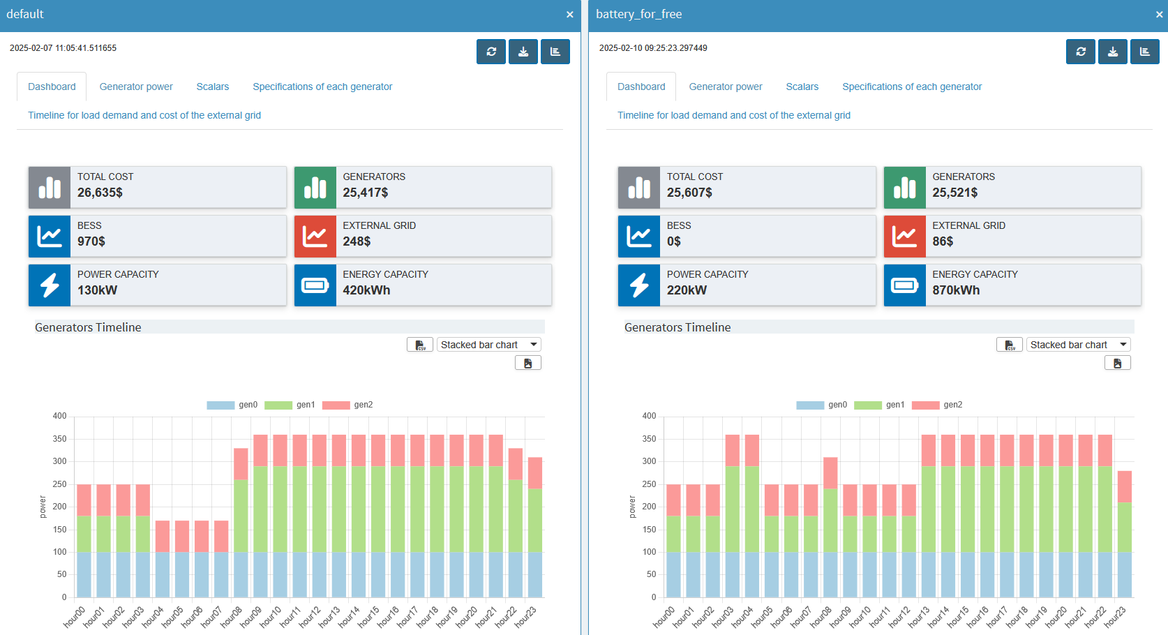
If you need to compare more than two scenarios, you can use the Tab view comparison mode, which organizes any number of scenarios (and their renderers) into separate tabs. Finally, the Pivot view comparison mode merges all scenario data into one pivot table for each symbol. It is the same pivot tool with its many possibilities that we have already used so much.
In addition to these ready-to-use comparison modes and custom compare modules, there is another one, dashboard comparison mode, which must be configured specifically for the app before it can be used. We will do this in the following.
The configuration of our regular dashboard renderer can be largely adopted, we just need to make some small adjustments:
-
We just configured the dashboard in the
dataRenderingsection of the <model_name>.json file. For scenario comparison, the configuration should be placed in a separate section calledcompareModules. -
While a regular dashboard configuration applies to a single symbol, a scenario comparison is symbol-unspecific. This means that the scenario comparison has access to all input and output symbol data by default. As a result, you don’t need to manually list each symbol under
additionalData. This also means that the symbol data to be used for a chart/table must be specified in each view in"dataViewsConfig"("data"property). However, if you have followed the tutorial, this was already done for all views. -
Instead of the
"outType"in the dashboard configuration, here we have a"type": "dashboard". -
We also need to assign a
labelthat will be displayed when the scenario comparison mode is selected. This label appears next to the options Split view, Tab view and Pivot view.
{
  "dataRendering": {
    "<lowercase_symbolname>": {
-       "outType": "dashboard",
-       "additionalData": [],
      "options": {
        "valueBoxesTitle": "",
        "valueBoxes": {
            ...
        },
        "dataViews": {
            ...
        },
        "dataViewsConfig": {
            ...
        }
      }
    }
  },
  "compareModules": [
    {
+     "type": "dashboard",
+     "label": "",
      "options": {
        "valueBoxesTitle": "",
        "valueBoxes": {
            ...
        },
        "dataViews": {
            ...
        },
        "dataViewsConfig": {
            ...
        }
      }
    }
  ]
}
While we can copy
"valueBoxes" and
"dataViews" directly,
we need to take a closer look at
"dataViewsConfig"! As
mentioned above, we need to specify what
"data" the view is
based on. Also, your data displayed in tables and graphs
now has an additional dimension, the scenario dimension,
where the scenarios to be compared are identified by
name. This additional
"_scenName" dimension
must be added in the views under
"dataViewsConfig". If
you put that dimension into the
"cols" section and do
not want to pre-select a scenario (but show all selected
scenarios instead), leave the value at
null.
"dataViewsConfig": {
  "SomeView" : {
    ...
    "cols": {
      "_scenName": null
    },
    ...
  }
}
The additional scenario dimension also changes the
appearance of the graphs. Some visualizations that were
suitable for normal output may no longer be suitable for
displaying multiple scenarios. In such cases, the view
configuration (distribution of dimensions in
rows/cols/aggregation, etc.) can be adjusted as needed.
The Pivot view comparison mode can help prepare
the views, just as we prepared the views for the
dashboard. In the dashboard, we used stacked bar charts.
If you start Compare scenarios in the
Pivot view for the
"report_output"
symbol, it will look like this:
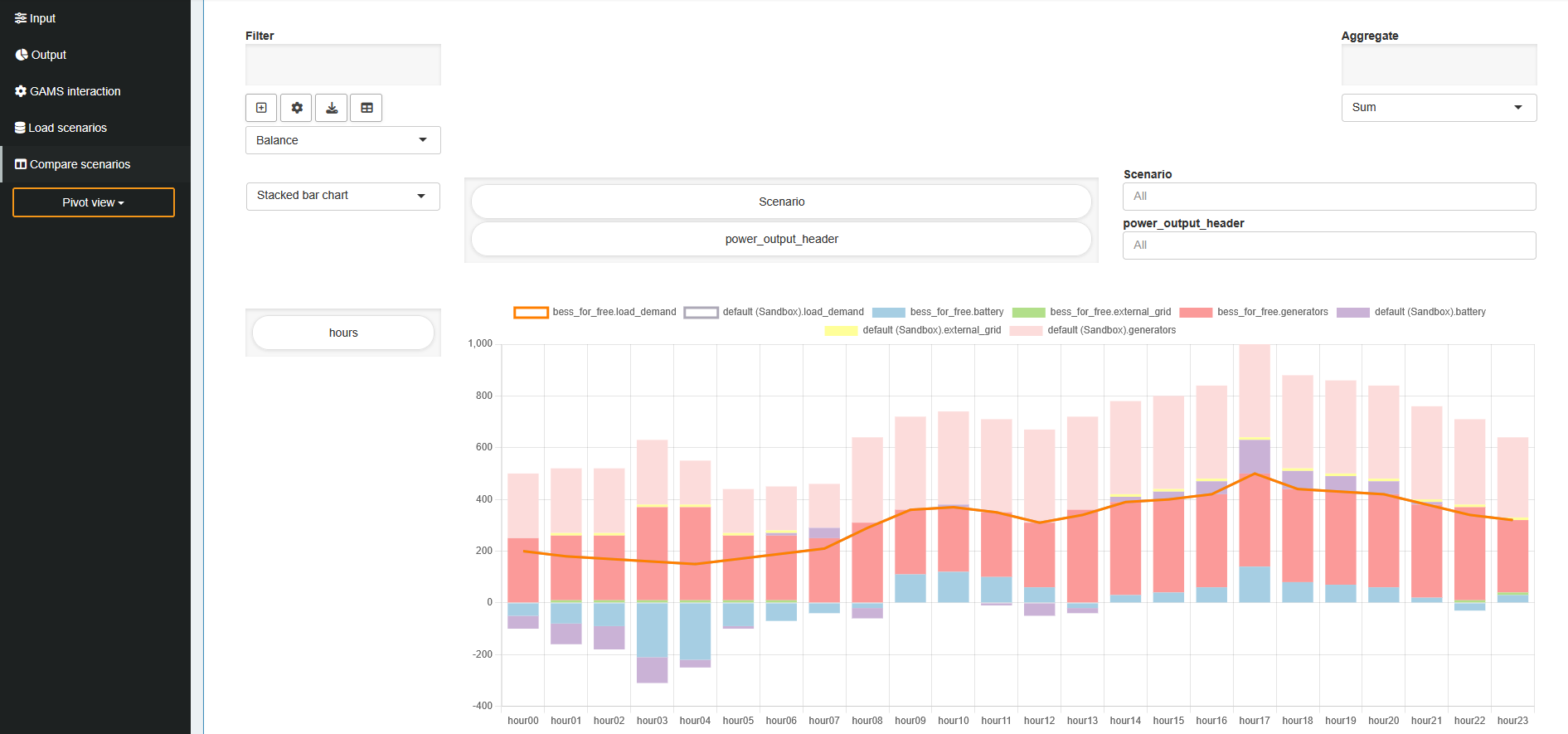
As you can see, the values for both scenarios are stacked
on top of each other, so it's no longer easy to see if
the load is fulfilled. Comparing the scenarios becomes
difficult. To fix this, click the
![]() icon to add a new view (or the edit button to
edit an existing one). In the view settings dialog that
opens, find "Group stacks by dimension" and add the
scenario dimension. This will group the stacked bars by
scenario.
icon to add a new view (or the edit button to
edit an existing one). In the view settings dialog that
opens, find "Group stacks by dimension" and add the
scenario dimension. This will group the stacked bars by
scenario.
We can also adjust the coloring so that the value for,
e.g.,
"generators", is the
same across all scenarios. The "Series Styling" tab in
the view menu allows to assign custom colors to
individual series. So you could assign the same color to
each series containing
"generators". Keep
in mind that this approach is not generic as the scenario
name is part of the dimensions. A generic,
scenario-independent approach is to define a color
pattern for all series that contain
"generators". This
can be done in the JSON file itself (read more about this
here).
The "Balance" view
could look like this:
"Balance": {
  "aggregationFunction": "sum",
  "chartOptions": {
    "customChartColors": {
      "battery": [
        "#a6cee3",
        "#558FA8"
      ],
      "external_grid": [
        "#b2df8a",
        "#699C26"
      ],
      "generators": [
        "#fb9a99",
        "#D64A47"
      ],
      "load_demand": [
        "#fdbf6f",
        "#B77E06"
      ]
    },
    "groupDimension": "_scenName",
    "multiChartOptions": {
      "multiChartRenderer": "line",
      "multiChartStepPlot": false,
      "showMultiChartDataMarkers": false,
      "stackMultiChartSeries": "no"
    },
    "multiChartSeries": "load_demand",
    "showXGrid": true,
    "showYGrid": true,
    "singleStack": false,
    "yLogScale": false,
    "yTitle": "power"
  },
  "cols": {
    "_scenName": null,
    "power_output_header": null
  },
  "data": "report_output",
  "domainFilter": {
    "default": null
  },
  "pivotRenderer": "stackedbar",
  "rows": "j",
  "tableSummarySettings": {
    "colSummaryFunction": "sum",
    "enabled": false,
    "rowSummaryFunction": "sum"
  },
  "userFilter": "_scenName"
}
The scenario comparison dashboard is ready! It now displays the data of all selected scenarios in the dashboard we are familiar with. The value boxes are empty by default. You can use a drop down menu above them to select a scenario from which the corresponding values are displayed. Now you can see directly how the costs of the BESS affect the use of the generators etc.
Key Takeaways
- Comprehensive Overview: Although configuring the dashboard requires some effort, it provides a unified view of all scenarios.
- Easy Comparison: Quickly compare multiple scenarios within a single dashboard for better insights.
After exploring all the out-of-the-box customizations for our application, the next step is to dive into the custom code extensions that MIRO offers. This will be the focus of our third and final part, where we will demonstrate how to write custom renderers, widgets, and importer/exporter functions in R. Don’t worry if you’ve never worked with R before-we’ll introduce you to all the necessary R functions.
Fine Tuning with Custom Code
In the first part of this tutorial we went from a GAMSPy model to a first basic GAMS MIRO application for this gallery example. In the second part we got familiar with the Configuration Mode. Nevertheless, sometimes we want to customize our MIRO application even more. MIRO supports this via custom code, specifically in R, which allows us to go beyond the standard visualizations.
Custom Renderer
We will start by creating a simple renderer that shows
the BESS storage level at each hour. Up to this point,
we only see how much power is charged or discharged
(battery_power). The
storage level itself can be computed by taking the
cumulative sum of
battery_power. In R,
this is easily done with
cumsum().
Note that if your data transformation is a simple function (e.g., a single cumulative sum), you could (and should!) do it directly in Python by creating a new output parameter, eliminating the need for a custom renderer, and directly use the pivot tool again for visualization. Here we use this example mainly to introduce custom renderers in MIRO.
Renderer Structure
First, we need to understand what the general structure of a custom renderer is in MIRO. For this we will closely follow the documentation. MIRO leverages R Shiny under the hood, which follows a two-function approach: 1. Placeholder function (server output): Where we specify the UI elements (plots, tables, etc.) and where they will be rendered. 2. Rendering function: Where we do the data manipulation, define the reactive logic, and produce the final display.
For more background on Shiny, see R Shiny’s official website.
A typical MIRO custom renderer follows this template
(using battery_power as
an example):
# Placeholder function must end with "Output"
mirorenderer_<lowercaseSymbolName>Output <- function(id, height = NULL, options = NULL, path = NULL){
  ns <- NS(id)
}

# The actual rendering must be prefixed with the keyword "render"
renderMirorenderer_<lowercaseSymbolName> <- function(input, output, session, data, options = NULL, path = NULL, rendererEnv = NULL, views = NULL, outputScalarsFull = NULL, ...){

}
If you are not using the Configuration Mode, you must save these functions in a file named mirorenderer_<lowercaseSymbolName>.R inside the renderer_<model_name> directory. However, if you are using the Configuration Mode, you can add the custom renderer directly under the Graphs by setting its charting type to Custom renderer. The Configuration Mode will automatically create the folder structure and place your R code in the correct location when you save.
Placeholder Function
The placeholder function creates the UI elements Shiny
will render. Shiny requires each element to have a
unique ID, managed via the
NS()
function, which appends a prefix to avoid naming
conflicts.
Here’s how it works in practice:
-
Define the prefix function: First, call
NS()with the renderer’s ID to create a function that we will store in a variablens. -
Use the prefix function on elements: Whenever you
define a new input or output element, prefix its ID
with
ns(). This will give each element a unique prefixed ID.
In our first example, we only want to draw a single plot of the BESS storage level. Hence, we define one UI element:
# Placeholder function
mirorenderer_battery_powerOutput <- function(id, height = NULL, options = NULL, path = NULL) {
    ns <- NS(id)
    plotOutput(ns("cumsumPlot"))
}
Note that instead of writing
plotOutput("cumsumPlot", ...), we use
plotOutput(ns("cumsumPlot"), ...)
to ensure that the
cumsumPlot is uniquely
identified throughout the application.
We only have one plot here, but you can create as many UI elements as you need. To get a better overview what is possible check the R Shiny documentation, e.g. their section on Arrange Elements.
Rendering Function
Next, we implement the actual renderer, which handles
data manipulation and visualization. We have defined an
output with the output function
plotOutput(). Now we need something to render inside. For this, we
assign
renderPlot()
to an output object inside the rendering function,
which is responsible for generating the plot. Here’s an
overview:
-
Output functions: These functions determine how the
data is displayed, such as
plotOutput(). -
Rendering functions: These are functions in Shiny
that transform your data into visual elements, such
as plots, tables, or maps. For example,
renderPlot()is a reactive plot suitable for assignment to an output slot.
Now we need a connection between our placeholder and the renderer. To do this, we look at the arguments the rendering function gets
-
input: Access to Shiny inputs, i.e. elements that generate data, such as sliders, text input,… (input$hour). -
output: Controls elements that visualize data, such as plots, maps, or tables (output$cumsumPlot). -
session: Contains user-specific information. -
data: The data for the visualization is specified as an R tibble. If you’ve specified multiple datasets in your MIRO application, the data will be a named list of tibbles. Each element in this list corresponds to a GAMS symbol (data$battery_power).
For more information about the other options, see the documentation.
We will now return to the Configuration Mode and start
building our first renderer. Hopefully you have already
added
plotOutput(ns("cumsumPlot"))
to the placeholder function. To get a general idea of
what we are working with, let us first take a look at
the
data by simply printing
it (print(data)) inside
the renderer. If we now press Update, we still
won’t see anything, because no rendering has been done
yet, but if we look at the console, we will see:
# A tibble: 24 x 6
    j      level marginal lower upper scale
    <chr>  <dbl>    <dbl> <dbl> <dbl> <dbl>
1 hour00   -50        0  -Inf   Inf     1
2 hour01   -80        0  -Inf   Inf     1
3 hour02   -90        0  -Inf   Inf     1
4 hour03  -100        0  -Inf   Inf     1
5 hour04   -30        0  -Inf   Inf     1
6 hour05   -10        0  -Inf   Inf     1
7 hour06    10        0  -Inf   Inf     1
8 hour07    40        0  -Inf   Inf     1
9 hour08   -40        0  -Inf   Inf     1
10 hour09     0        0  -Inf   Inf     1
# i 14 more rows
Since we have not specified any additional data sets so
far, data directly
contains the variable
battery_power, which is
the GAMS symbol we put in the mirorender name. For our
plot of the storage levels we now need the values from
the level column, which
we can access in R with
data$level. More on
subsetting tibbles can be found
here.
Let’s now finally make our first plot! First we need to
calculate the data we want to plot, which we store in
storage_level. The
values in
battery_power are from
the city’s perspective; negative means charging the
BESS, positive means discharging. We negate the
cumulative sum to get the actual storage level. We use
the standard R
barplot()
for visualization, but any plotting library can be
used. Finally, we just need to pass this reactive plot
to a render function and assign it to the appropriate
output variable. The code should look like this:
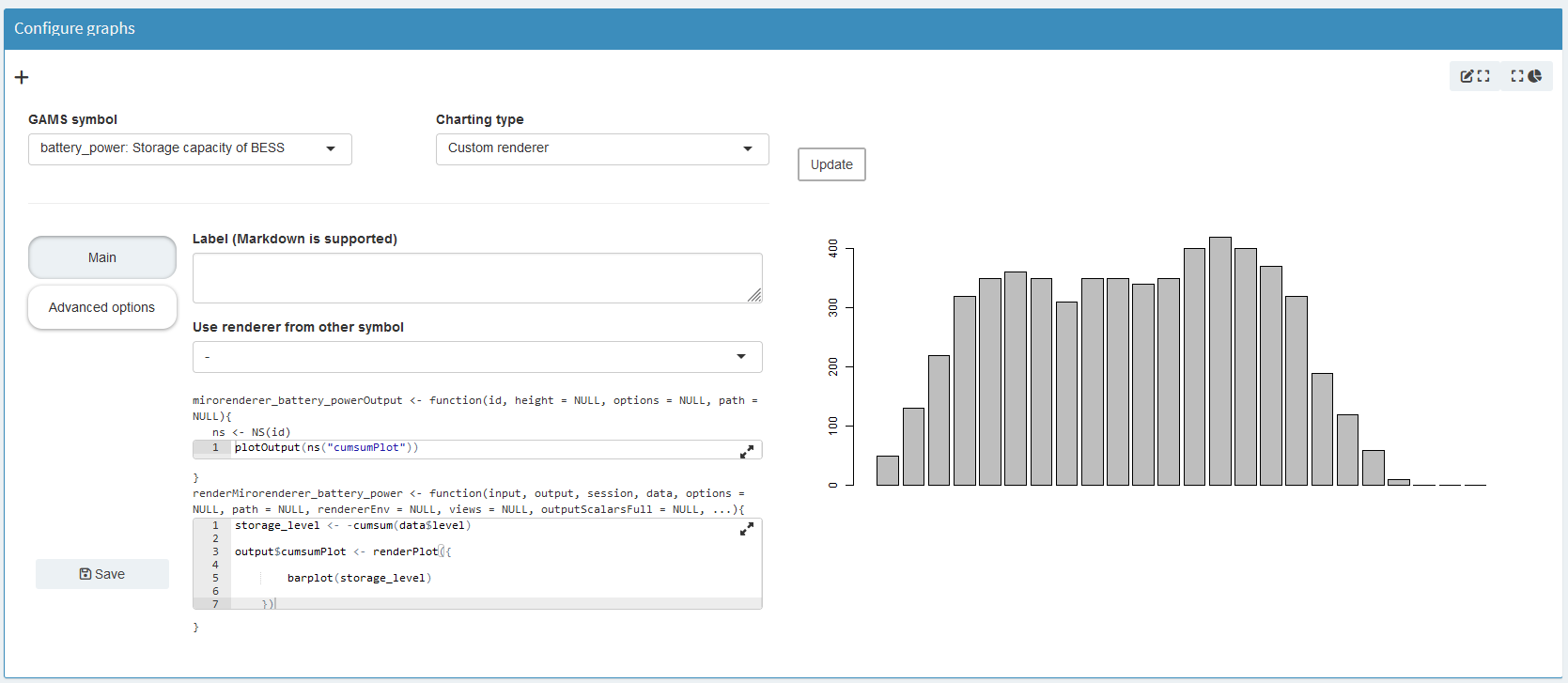
storage_level <- -cumsum(data$level)
output$cumsumPlot <- renderPlot({
    barplot(storage_level)
})
If you press Update again, you should get this:
Now let’s make this graph prettier. Aside from adding a
title, labels, etc., take a look at the y-axis. As you
can see, it doesn’t go all the way to the top. To
change this, we can set it to the maximum value of our
data. But what might be more interesting is to see the
current storage value compared to the maximum possible.
As you may remember, this maximum storage level is also
part of our optimization. So now we need to add data
from other model symbols to our renderer. First go to
Advanced options and then by clicking on
Additional datasets to communicate with the custom
renderer
we will see all the symbols we can add to the renderer.
Since we need the data from the scalar variable
battery_storage, we add
"_scalarsve_out". Going
back to the Main tab, we now need to change
how we access the data, since
data is no longer a
single tibble, but a named list of tibbles. In the
example below we use
filter()
and
pull()
to extract the desired data. Note that
%>% is the pipe
operator, which is used to pass the result of an
expression or function as the input to the next
function in a sequence, improving the readability and
flow of your code.
max_storage <- data[["_scalarsve_out"]] %>%
  filter(scalar == "battery_storage") %>%
  pull(level)
We will use the
"battery_storage" for
adding a horizontal line with
abline(). Adding some more layout settings leads us to:
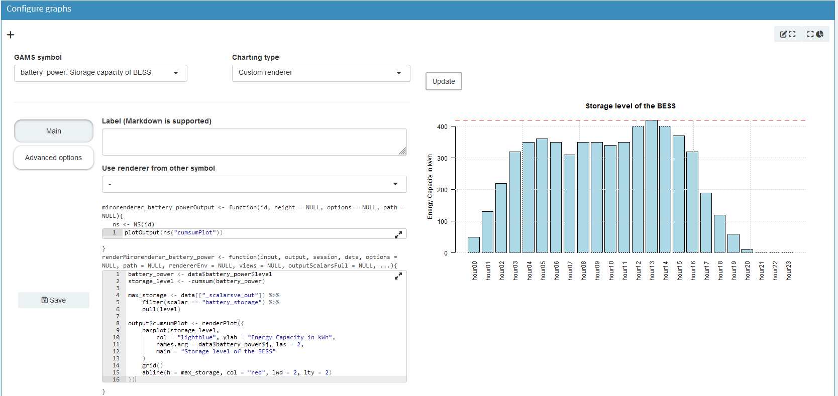
Click to see the full code of the renderer
mirorenderer_battery_powerOutput <- function(id, height = NULL, options = NULL, path = NULL) {
ns <- NS(id)
plotOutput(ns("cumsumPlot"))
}
renderMirorenderer_battery_power <- function(input, output, session, data, options = NULL, path = NULL, rendererEnv = NULL, views = NULL, outputScalarsFull = NULL, ...) {
battery_power <- data$battery_power$level
storage_level <- -cumsum(battery_power)
max_storage <- data[["_scalarsve_out"]] %>%
filter(scalar == "battery_storage") %>%
pull(level)
output$cumsumPlot <- renderPlot({
barplot(storage_level,
col = "lightblue", ylab = "Energy Capacity in kWh",
names.arg = data$battery_power$j, las = 2,
main = "Storage level of the BESS"
)
grid()
abline(h = max_storage, col = "red", lwd = 2, lty = 2)
})
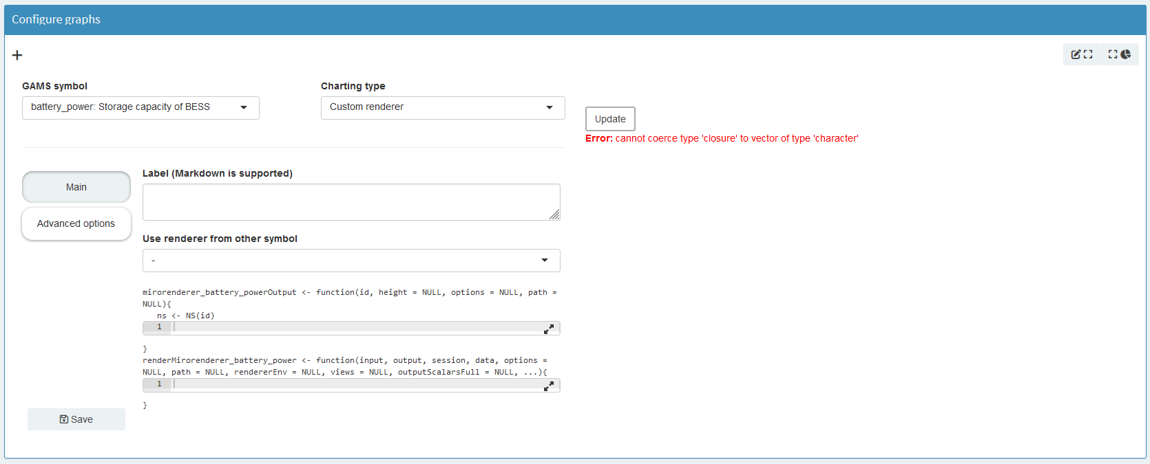
}By clicking Save, the Configuration Mode generates the file structure and JSON configuration automatically. Again, if you are not using the Configuration Mode, you will need to add this manually. The template can be found in the documentation.
Congratulations you created your first renderer!
Now that we have created our first small custom renderer, we can start working on some more complex renderers.
A more complex renderer
We are going to make a simple Sankey diagram for our
power flow. We will base this renderer on our
report_output variable
which contains the three power variables and the load
demand. It will show the current power flow at a given
hour. To change the hour we will add a slider. This
results in the following placeholder function:
mirorenderer_report_outputOutput <- function(id, height = NULL, options = NULL, path = NULL) {
  ns <- NS(id)
  tagList(
    sliderInput(ns("hour"), "Hour:",
      min = 0, max = 23,
      value = 0, step = 1,
    ),
    plotly::plotlyOutput(ns("sankey"), height = "100%")
  )
}
Since we just want both elements on top of each other,
we use a
tagList(). First we have our slider, which we give an id, again
using the ns() function
to prefix it. We set
min,
max, initial
value and
stepsize. Second, we
have a plot for which we use
plotlyOutput(), since we will be using the plotly library
to generate the Sankey plot. Because plotly is not part
of MIRO’s core, we must add the package to our
environment. This can be done in the same way as the
additional data in the Advanced options menu.
This also means that we need to specify the package
name explicitly using the
double colon operator. Again, if you are not
using the Configuration Mode, follow the
documentation.
Now that we have some placeholders, we need to fill them. Let us begin to set up our Sankey diagram. First, we need to decide which nodes we need. We will add one for the BESS, the generators, the external grid, and the city. You need to remember the order so that you can assign the links correctly later.
node = list(
  label = c("BESS", "Generators", "External Grid", "City"),
  color = c("blue", "green", "red", "black"),
  pad = 15,
  thickness = 20,
  line = list(
    color = "black",
    width = 0.5
  )
)
With the nodes defined we need to set the links. Each link has a source, a target and a value. The possible sources and targets are defined by our given nodes. We will define lists for all three and fill them based on our data.
link = list(
    source = sankey_source,
    target = sankey_target,
    value =  sankey_value
)
To be able to display the power value of the correct
time point we need to get the hour from our slider,
which we get from our
input parameter.
hour_to_display <- sprintf("hour%02d", input$hour)
Note that we use
sprintf()
to get the same string we use to represent the hour in
our GAMS symbols, so that we can filter the data for
the correct hour.
Here we need to be careful:
input is a reactive
variable, it automatically updates the diagram when the
slider is updated. This means we need to put it in a
reactive context. For example, in R you can use
observe(). However, since our rendering depends on only one
input and only one output, we keep it simple and place
all our calculations inside
renderPlotly(). We can
do this because rendering functions are also observers.
If you want to learn more about R Shiny’s reactive
expressions, you can find a more detailed tutorial
here.
With that figured out, we need to extract the correct
power values. First we need to select the correct power
type, then the current hour and add it to the links if
it is not zero. Because GAMS doesn’t store zeros, we
need to check if a row exists for each hour-power
combination. Here you see how to do it for the
battery_power:
battery_to_display <- filter(data, power_output_header == "battery") %>%
  filter(j == hour_to_display)
Click to see the other two power sources
gen_to_display <- filter(data, power_output_header == "generators") %>%
  filter(j == hour_to_display)
extern_to_display <- filter(data, power_output_header == "external_grid") %>%
  filter(j == hour_to_display)
Now that we have our values, we need to add them to our
link list. But remember to make sure that the value
exists (here using
dim()), and for the BESS we need to keep in mind that we
can have positive and negative power flows, either from
the city to the BESS or the other way around! Here is a
way to add the BESS links:
# go over each source and check if they exist and if so add the corresponding link
if (dim(battery_to_display)[1] != 0) {
  # for the battery need to check if is charged, or discharged
  if (battery_to_display[["value"]] > 0) {
    sankey_source <- c(sankey_source, 0)
    sankey_target <- c(sankey_target, 3)
    sankey_value <- c(sankey_value, battery_to_display[["value"]])
  } else {
    sankey_source <- c(sankey_source, 3)
    sankey_target <- c(sankey_target, 0)
    sankey_value <- c(sankey_value, -battery_to_display[["value"]])
  }
}
Add similar code snippets for the remaining two power sources.
Click to see the other two power sources
if (dim(gen_to_display)[1] != 0) {
  sankey_source <- c(sankey_source, 1)
  sankey_target <- c(sankey_target, 3)
  sankey_value <- c(sankey_value, gen_to_display[["value"]])
}

if (dim(extern_to_display)[1] != 0) {
  sankey_source <- c(sankey_source, 2)
  sankey_target <- c(sankey_target, 3)
  sankey_value <- c(sankey_value, extern_to_display[["value"]])
}
With this, we have all the necessary components to
render the Sankey diagram. We add one more small
feature. Sliders can be animated quite easily in R
Shiny. All you need to do is add an animate option to
the
sliderInput() function:
animate = animationOptions(
  interval = 1000, loop = FALSE,
  playButton = actionButton("play", "Play", icon = icon("play"), style = "margin-top: 10px;"),
  pauseButton = actionButton("pause", "Pause", icon = icon("pause"), style = "margin-top: 10px;")
)
Now we can inspect the hourly power flow between generators, the external grid, BESS, and the city. The slider animates this flow over time.
Click to see the code of the full renderer
mirorenderer_report_outputOutput <- function(id, height = NULL, options = NULL, path = NULL) {
  ns <- NS(id)
  tagList(
    sliderInput(ns("hour"), "Hour:",
      min = 0, max = 23,
      value = 0, step = 1,
      animate = animationOptions(
        interval = 1000, loop = FALSE,
        playButton = actionButton("play", "Play", icon = icon("play"), style = "margin-top: 10px;"),
        pauseButton = actionButton("pause", "Pause", icon = icon("pause"), style = "margin-top: 10px;")
      )
    ),
    # since plotly is a custom package, it is not attached by MIRO to avoid name collisions
    # Thus, we have to prefix functions exported by plotly via the "double colon operator":
    # plotly::renderPlotly
    plotly::plotlyOutput(ns("sankey"), height = "100%")
  )
}

renderMirorenderer_report_output <- function(input, output, session, data, options = NULL, path = NULL, rendererEnv = NULL, views = NULL, outputScalarsFull = NULL, ...) {
  # since renderPlotly (or any other render function) is also an observer we are already in an reactive context
  output$sankey <- plotly::renderPlotly({
    hour_to_display <- sprintf("hour%02d", input$hour)

    # start with empty lists for the sankey links
    sankey_source <- list()
    sankey_target <- list()
    sankey_value <- list()

    # since the GAMS output is melted, first need to extract the different power sources
    battery_to_display <- filter(data, power_output_header == "battery") %>%
      filter(j == hour_to_display)
    gen_to_display <- filter(data, power_output_header == "generators") %>%
      filter(j == hour_to_display)
    extern_to_display <- filter(data, power_output_header == "external_grid") %>%
      filter(j == hour_to_display)

    # go over each source and check if they exist and if so add the corresponding link
    if (dim(battery_to_display)[1] != 0) {
      # for the battery need to check if is charged, or discharged
      if (battery_to_display[["value"]] > 0) {
        sankey_source <- c(sankey_source, 0)
        sankey_target <- c(sankey_target, 3)
        sankey_value <- c(sankey_value, battery_to_display[["value"]])
      } else {
        sankey_source <- c(sankey_source, 3)
        sankey_target <- c(sankey_target, 0)
        sankey_value <- c(sankey_value, -battery_to_display[["value"]])
      }
    }

    if (dim(gen_to_display)[1] != 0) {
      sankey_source <- c(sankey_source, 1)
      sankey_target <- c(sankey_target, 3)
      sankey_value <- c(sankey_value, gen_to_display[["value"]])
    }

    if (dim(extern_to_display)[1] != 0) {
      sankey_source <- c(sankey_source, 2)
      sankey_target <- c(sankey_target, 3)
      sankey_value <- c(sankey_value, extern_to_display[["value"]])
    }

    # finally generate the sankey diagram using plotly
    plotly::plot_ly(
      type = "sankey",
      orientation = "h",
      node = list(
        label = c("BESS", "Generators", "External Grid", "City"),
        color = c("blue", "green", "red", "black"),
        pad = 15,
        thickness = 20,
        line = list(
          color = "black",
          width = 0.5
        )
      ),
      link = list(
        source = sankey_source,
        target = sankey_target,
        value =  sankey_value
      )
    )
  })
}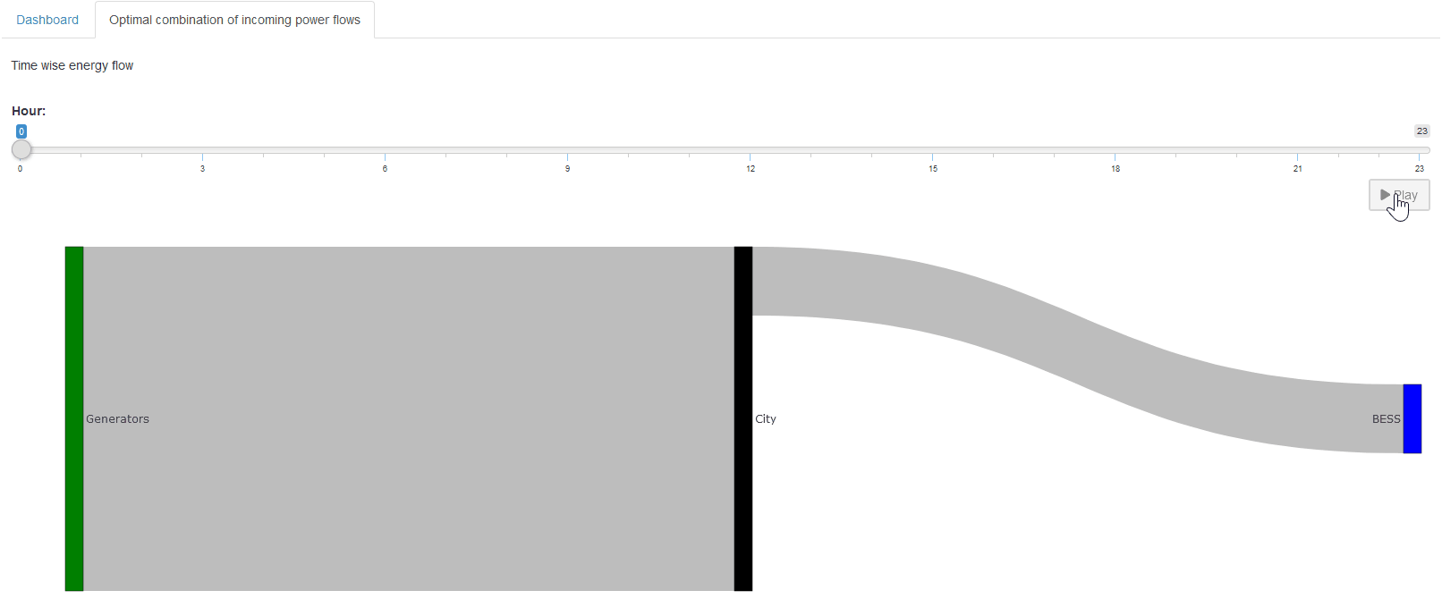
Hopefully you now have a better idea of what is possible with custom renderers and how to easily use the Configuration Mode to implement them.
Custom Dashboard
Now that we know so much more about custom renderers, let us embed custom code in our dashboard. We will add the simple renderer for the storage level of the BESS. We follow the documentation closely for this. To add custom code to the renderer, we no longer just use json, but we use the dashboard as a custom renderer. The dashboard renderer has been prepared to do this with minimal effort.
-
Download the latest dashboard renderer file from the GAMS MIRO repository on GitHub and put it with the other renderers in your renderer_<model_name> directory.
-
In the dashboard.R file, make the following changes:
- dashboardOutput <- function(id, height = NULL, options = NULL, path = NULL) {
+ mirorenderer__scalarsve_outOutput <- function(id, height = NULL, options = NULL, path = NULL) {
    ns <- NS(id)
    ...
  }
- renderDashboard <- function(id, data, options = NULL, path = NULL, rendererEnv = NULL, views = NULL, outputScalarsFull = NULL, ...) {
+ renderMirorenderer__scalarsve_out <- function(input, output, session, data, options = NULL, path = NULL, rendererEnv = NULL, views = NULL, outputScalarsFull = NULL, ...) {
-   moduleServer(
-     id,
-     function(input, output, session) {
        ns <- session$ns
        ...

# These are the last three lines of code in the file
- }
-)
}
Remember that the dashboard is rendered for the symbol
"_scalarsve_out". As
with the other renderers, be sure to replace it with
the symbol name you want to render if you create a
dashboard for a different symbol.
-
In the
dataRenderingsection of the <model_name>.json file change the"outType"of the symbol to render from"dashboard"to"mirorenderer_<symbolname>"
  {
    "dataRendering": {
      "_scalarsve_out": {
-      "outType": "dashboard",
+      "outType": "mirorenderer__scalarsve_out",
        "additionalData": [...],
        "options": {...}
      }
    }
  }
Now you can restart the application and have the same renderer as before, only now we can extend it with custom code!
To add custom code, we first need to decide where to
put it. Here we will add it as a second element to the
battery_power view.
Note that the given title will be ignored by the custom
code, so we will leave it empty.
"dataViews": {
  "battery_power": [
    {"BatteryTimeline": "Charge/Discharge of the BESS"},
    {"BatteryStorage": ""}
  ],
  ...
}
In the corresponding
"dataViewsConfig"
section we now assign an arbitrary string, e.g. "BatteryStorage": "customCode", instead of a view configuration as before:
"dataViewsConfig": {
  "BatteryStorage": "customCode",
  ...
}
Finally, we can add the custom code. Recall that in our
custom renderers, we always defined placeholders with
unique IDs that were then assembled into the
output variable. The
view ID we just added ("BatteryStorage") will also be added to the
output variable. Now we
just add our already implemented renderer to the render
function (renderMirorenderer__scalarsve_out). The only thing we have to change is the output to
which we assign the plot:
output[["BatteryStorage"]] <- renderUI(...). And remember that we are no longer in our renderer
for the symbol
battery_power, so
battery_power is now
additional data that we access with
data$battery_power.
However, since we have already added additional data to
the renderer before, the code does not change. Just
keep in mind that if the renderer you’re adding didn’t
have additional data before, you’ll have to change how
you access the data! To keep track, we add the new
output assignment at the end of the dashboard renderer,
but as long as it’s inside the renderer, the order
doesn’t matter.
renderMirorenderer__scalarsve_out <- function(input, output, session, data, options = NULL, path = NULL, rendererEnv = NULL, views = NULL, outputScalarsFull = NULL, ...) {

  ...

  battery_power <- data$battery_power$level
  storage_level <- -cumsum(battery_power)

  max_storage <- data[["_scalarsve_out"]] %>%
    filter(scalar == "battery_storage") %>%
    pull(level)

  # corresponding to the dataView "BatteryStorage"
  output[["BatteryStorage"]] <- renderUI({
    tagList(
      renderPlot({
        barplot(storage_level,
          col = "lightblue", ylab = "Energy Capacity in kWh",
          names.arg = data$battery_power$j, las = 2,
          main = "Storage level of the BESS"
        )
        grid()
      })
    )
  })
}
In the same way, you can create a view that’s entirely made up of custom code or include as many custom code elements as you like.
Dashboard Comparison with Custom Code
You can also introduce custom renders to the dashboard comparison. Since this is quite similar to what we just did, we won't go over it again here. If you want to include the custom renderer, simply follow the documentation. Just note that you cannot directly copy your old custom renderer; you'll need to adapt it to the new data structure, which now includes the scenario dimension!
Custom Widget
Let’s take a closer look at another aspect of MIRO customization—creating a custom widget. Until now, our custom renderers have been for data visualization only. But for input symbols, we can also use custom code that allows you to produce input data that is sent to your model. This means that the input data for your GAMS(Py) model can be generated by interactively modifying a chart, table or other type of renderer.
In MIRO, each symbol tab provides both a tabular and a graphical data representation by default. If you have a custom renderer for an input symbol, you would typically switch to the graphical view to see it. However, modifying the actual data to be sent to the model requires using the tabular view. In the following example, we will write a custom input widget that replaces the default tabular view for an input symbol. Since we have complete control over what to display in this custom widget, we can include an editable table for data manipulation as well as a visualization that updates whenever the table data changes—providing a more seamless and interactive way to prepare input for your model.
Currently, the Configuration Mode does not offer direct support for implementing custom input widgets, but we can create them the same way we create a custom renderer and then make a few changes to convert it into a widget.
First, we develop a placeholder function that displays
both a plot and a data table. For the table we will use
R Shinys
DataTables. To do this, you must first add
DT
to the additional packages and prefix the corresponding
functions in the code. To define the output we use
DT:DTOutput():
mirorenderer_timewise_load_demand_and_cost_external_grid_dataOutput <- function(id, height = NULL, options = NULL, path = NULL){
  ns <- NS(id)
  fluidRow(
    column(width = 12, plotOutput(ns("timeline"))),
    column(width = 12, DT::DTOutput(ns("table")))
  )
}
Before we make it interactive, let’s fill in our
placeholders. For the table, we assign it with
DT:renderDT(), where we define the
DT:datatable()
and we will round our cost values with
DT:formatRound():
output$table <- DT::renderDT({
  DT::datatable(data, editable = TRUE, rownames = FALSE, options = list(scrollX = TRUE)) %>%
    DT::formatRound(c("cost_external_grid"), digits = 2L)
})
Here,
editable = TRUE is
crucial—it allows users to modify the table entries.
For the plot, we need something like this:
output$timeline <- renderPlot({
  ...
})
We have two variables measured in different units
(load_demand
in W and
cost_external_grid in
$), and we want to display them on the same plot. Take
a look at the remaining code to see how it might be
structured. One approach is to use
par()
and
axis()
to overlay two y-axes.
Click to see the code
renderMirorenderer_timewise_load_demand_and_cost_external_grid_data <- function(input, output, session, data, options = NULL, path = NULL, rendererEnv = NULL, views = NULL, outputScalarsFull = NULL, ...){
  # return the render for the placeholder "table"
  output$table <- DT::renderDT({
    DT::datatable(data, editable = TRUE, rownames = FALSE, options = list(scrollX = TRUE)) %>%
      DT::formatRound(c("cost_external_grid"), digits = 2L)
  })

  # return the render for the placeholder "timeline"
  output$timeline <- renderPlot({
    # first extract all the needed information
    x <- data[["j"]]
    y1 <- data[["load_demand"]]
    y2 <- data[["cost_external_grid"]]

    # set the margin for the graph
    par(mar = c(5, 4, 4, 5))

    # first, plot the load demand
    plot(y1,
      type = "l", col = "green",
      ylab = "Load demand in W", lwd = 3, xlab = "", xaxt = "n", las = 2
    )
    points(y1, col = "green", pch = 16, cex = 1.5)
    grid()

    # add second plot on the same graph for the external cost
    par(new = TRUE) # overlay a new plot
    plot(y2,
      type = "l", col = "blue",
      axes = FALSE, xlab = "", ylab = "", lwd = 3
    )
    points(y2, col = "blue", pch = 16, cex = 1.5)

    # add a new y-axis on the right for the second line
    axis(side = 4, las = 2)
    mtext("External grid cost in $", side = 4, line = 3)
    grid()

    # add the x values to the axis
    axis(side = 1, at = 1:length(x), labels = x, las = 2)

    legend("topleft",
      legend = c("Load demand", "External grid cost"),
      col = c("green", "blue"), lty = 1, lwd = 2, pch = 16
    )
  })
}
Now you should see something like this:
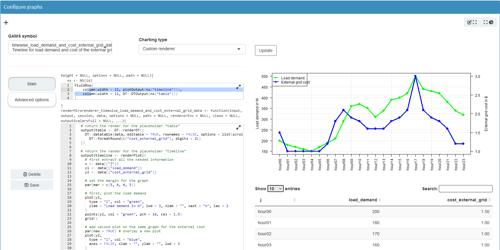
At this point, any changes we make in the table do not reflect in the plot. To fix this, we need reactive expressions. We need to add them for each interaction that should result in an update.
First, we define a variable
rv for our
reactiveValues.
rv <- reactiveValues(
  timewise_input_data = NULL
)
To set
rv$timewise_input_data
we
observe()
the initial data. If it
changes we set our reactive value to the data.
observe({
  rv$timewise_input_data <- data
})
To monitor edits to the table, we define a new
observe() that will be
triggered when
input$table_cell_edit
changes. We get the row and column index of the edited
cell (input$table_cell_edit$row
and
input$table_cell_edit$col) and update the corresponding value in
rv$timewise_input_data.
The
isolate()
function ensures that changes to
rv do not trigger this
observe() function.
# observe if the table is edited
observe({
  input$table_cell_edit

  row <- input$table_cell_edit$row
  # need to add one since the first column is the index
  clmn <- input$table_cell_edit$col + 1

  isolate({
    rv$timewise_input_data[row, clmn] <- input$table_cell_edit$value
  })
})
If the new value of the entry would be empty (""), we want to reset the table. To do this, we set up a
dataTableProxy()
to efficiently update the table. Our
resetTable() function
is defined to dynamically replace the table data using
the current state of
rv$timewise_input_data.
The function
DT::replaceData()
allows the table to be updated without resetting
sorting, filtering, and pagination. We need to
isolate() the data
again so that the function is not called if
rv changes!
tableProxy <- DT::dataTableProxy("table")
resetTable <- function() {
  DT::replaceData(tableProxy, isolate(rv$timewise_input_data), resetPaging = FALSE, rownames = FALSE)
}
Finally, we now need to reference
rv$timewise_input_data
instead of data in the
plot renderer, so that the plot is updated whenever a
table cell changes.
Click to see the full code of the current state
renderMirowidget_timewise_load_demand_and_cost_external_grid_data <- function(input, output, session, data, options = NULL, path = NULL, rendererEnv = NULL, views = NULL, outputScalarsFull = NULL, ...) {
  # The whole code is run at the beginning, even though no actions are performed yet.
  # init is used to only perform action in observe() after this initial run.
  # Therefore, it is set to TRUE in the last occurring observe()
  init <- FALSE
  rv <- reactiveValues(
    timewise_input_data = NULL
  )

  # set the initial data
  observe({
    rv$timewise_input_data <- data
  })

  tableProxy <- DT::dataTableProxy("table")

  resetTable <- function() {
    DT::replaceData(tableProxy, isolate(rv$timewise_input_data), resetPaging = FALSE, rownames = FALSE)
  }

  # observe if the table is edited
  observe({
    input$table_cell_edit
    row <- input$table_cell_edit$row
    # need to add one since the first column is the index
    clmn <- input$table_cell_edit$col + 1

    # if the new value is empty, restore the value from before
    if (input$table_cell_edit$value == "") {
      resetTable()
      return()
    }

    # else, update the corresponding value in the reactiveValue
    isolate({
      rv$timewise_input_data[row, clmn] <- input$table_cell_edit$value
    })
  })

  # return the render for the placeholder "table"
  output$table <- DT::renderDT({
    DT::datatable(rv$timewise_input_data, editable = TRUE, rownames = FALSE, options = list(scrollX = TRUE)) %>%
      DT::formatRound(c("cost_external_grid"), digits = 2L)
  })

  # return the render for the placeholder "timeline"
  output$timeline <- renderPlot({
    # first extract all the needed information
    x <- rv$timewise_input_data[["j"]]
    y1 <- rv$timewise_input_data[["load_demand"]]
    y2 <- rv$timewise_input_data[["cost_external_grid"]]

    # set the margin for the graph
    par(mar = c(5, 4, 4, 5))

    # first, plot the load demand
    plot(y1,
      type = "l", col = "green",
      ylab = "Load demand in W", lwd = 3, xlab = "", xaxt = "n", las = 2
    )
    points(y1, col = "green", pch = 16, cex = 1.5)
    grid()

    # add second plot on the same graph for the external cost
    par(new = TRUE) # overlay a new plot
    plot(y2,
      type = "l", col = "blue",
      axes = FALSE, xlab = "", ylab = "", lwd = 3
    )
    points(y2, col = "blue", pch = 16, cex = 1.5)

    # add a new y-axis on the right for the second line
    axis(side = 4, las = 2)
    mtext("External grid cost in $", side = 4, line = 3)
    grid()

    # add the x values to the axis
    axis(side = 1, at = 1:length(x), labels = x, las = 2)

    legend("topleft",
      legend = c("Load demand", "External grid cost"),
      col = c("green", "blue"), lty = 1, lwd = 2, pch = 16
    )
  })
}
After these changes, we have a reactive table-plot combination, but it still behaves like an output renderer. We need to take a few final steps to turn this into a custom input widget so that the new data can be used to solve!
From Custom Renderer To Custom Widget
To turn the renderer into a widget, we save our renderer in the Configuration Mode and go to the directory where it was saved. Here we first need to change the name of the file to mirowidget_timewise_load_demand_and_cost_external_grid_data.R Now we need to rename the functions:
- mirorenderer_timewise_load_demand_and_cost_external_grid_dataOutput <- function(id, height = NULL, options = NULL, path = NULL){
+ mirowidget_timewise_load_demand_and_cost_external_grid_dataOutput <- function(id, height = NULL, options = NULL, path = NULL) {
  ...
}

- renderMirorenderer_timewise_load_demand_and_cost_external_grid_data <- function(input, output, session, data, options = NULL, path = NULL, rendererEnv = NULL, views = NULL, outputScalarsFull = NULL, ...){
+ renderMirowidget_timewise_load_demand_and_cost_external_grid_data <- function(input, output, session, data, options = NULL, path = NULL, rendererEnv = NULL, views = NULL, outputScalarsFull = NULL, ...) {
  ...
}
We need to make some small changes to our code. The
data parameter is no
longer a tibble, but a
reactive expression
(data()). Therefore, we
need to call it to retrieve the current tibble with our
input data. Whenever the data changes (for example,
because the user uploaded a new CSV file), the reactive
expression is triggered, which in turn causes our table
to be re-rendered with the new data.
# set the initial data
 observe({
-  rv$timewise_input_data <- data
+ rv$timewise_input_data <- data()
 })
All code is executed when the application is started,
even though no actions have been performed yet. The
init is used to execute
actions in
observe() only after
this initial execution. It ensures that the reactive
logic is not executed until the application is fully
initialized and all data is loaded. Since we only have
one observe() we set it
to True here, if we had
more we would set
init to
True in the last
observe() block.
if (!init) {
  init <<- TRUE
  return()
}
Now, we need to return the input data to be passed to
GAMS(Py). For this, we provide a
reactive()
wrapper around
rv$timewise_input_data.
It ensures that the current state of the data is
available as a reactive output, allowing us to pass the
new data to the model. Otherwise
Solve model would still use the old data!
return(reactive({
  rv$timewise_input_data
}))
Click to see the full code
renderMirowidget_timewise_load_demand_and_cost_external_grid_data <- function(input, output, session, data, options = NULL, path = NULL, rendererEnv = NULL, views = NULL, outputScalarsFull = NULL, ...) {
  # The whole code is run at the beginning, even though no actions are performed yet.
  # init is used to only perform action in observe() after this initial run.
  # Therefore, it is set to TRUE in the last occurring observe()
  init <- FALSE
  rv <- reactiveValues(
    timewise_input_data = NULL
  )

  # set the initial data
  observe({
    rv$timewise_input_data <- data()
  })

  tableProxy <- DT::dataTableProxy("table")

  resetTable <- function() {
    DT::replaceData(tableProxy, isolate(rv$timewise_input_data), resetPaging = FALSE, rownames = FALSE)
  }

  # observe if the table is edited
  observe({
    input$table_cell_edit
    if (!init) {
      init <<- TRUE
      return()
    }
    row <- input$table_cell_edit$row
    # need to add one since the first column is the index
    clmn <- input$table_cell_edit$col + 1

    # if the new value is empty, restore the value from before
    if (input$table_cell_edit$value == "") {
      resetTable()
      return()
    }

    # else, update the corresponding value in the reactiveValue
    isolate({
      rv$timewise_input_data[row, clmn] <- input$table_cell_edit$value
    })
  })

  # return the render for the placeholder "table"
  output$table <- DT::renderDT({
    DT::datatable(rv$timewise_input_data, editable = TRUE, rownames = FALSE, options = list(scrollX = TRUE)) %>%
      DT::formatRound(c("cost_external_grid"), digits = 2L)
  })

  # return the render for the placeholder "timeline"
  output$timeline <- renderPlot({
    # first extract all the needed information
    x <- rv$timewise_input_data[["j"]]
    y1 <- rv$timewise_input_data[["load_demand"]]
    y2 <- rv$timewise_input_data[["cost_external_grid"]]

    # set the margin for the graph
    par(mar = c(5, 4, 4, 5))

    # first, plot the load demand
    plot(y1,
      type = "l", col = "green",
      ylab = "Load demand in W", lwd = 3, xlab = "", xaxt = "n", las = 2
    )
    points(y1, col = "green", pch = 16, cex = 1.5)
    grid()

    # add second plot on the same graph for the external cost
    par(new = TRUE) # overlay a new plot
    plot(y2,
      type = "l", col = "blue",
      axes = FALSE, xlab = "", ylab = "", lwd = 3
    )
    points(y2, col = "blue", pch = 16, cex = 1.5)

    # add a new y-axis on the right for the second line
    axis(side = 4, las = 2)
    mtext("External grid cost in $", side = 4, line = 3)
    grid()

    # add the x values to the axis
    axis(side = 1, at = 1:length(x), labels = x, las = 2)

    legend("topleft",
      legend = c("Load demand", "External grid cost"),
      col = c("green", "blue"), lty = 1, lwd = 2, pch = 16
    )
  })

  # since this is an input, need to return the final data
  return(reactive({
    rv$timewise_input_data
  }))
}
Finally, we need to remove the renderer in
<model_name>.json and
instead add
"timewise_load_demand_and_cost_external_grid_data"
to the
"inputWidgets":
"inputWidgets": {
  ...

  "timewise_load_demand_and_cost_external_grid_data": {
    "alias": "Timeline for load demand and cost of the external grid",
    "apiVersion": 2,
    "options": {
        "isInput": true
    },
    "rendererName": "mirowidget_timewise_load_demand_and_cost_external_grid_data",
    "widgetType": "custom"
  }
}
Congratulations—our new custom widget combines a table and a plot, with both updating interactively. At this point, Solve model will use our updated table whenever we change values and re-run the model.
Now that you’ve mastered the basics of custom renderers in MIRO, you can explore more creative implementations. If you need more inspiration on what you can do with the custom renderer, take a look at the MIRO gallery, e.g. take a look at some applications with maps (TSP or VRPTW).
Key Takeaways
- Unlimited Customization: R-based renderers let you do anything from advanced plotting to building interactive features.
- Leverage Shiny Ecosystem: Shiny’s reactive expressions help you link user actions (sliders, clicks) with real-time graph updates.
- GAMS(Py) for Logic, R for Visuals: Use Python or GAMS to handle calculations; R custom renderers are perfect for specialized visual displays.
Custom Import and Export: Streamlining Your Data Workflow
In any data-centric project, the ability to efficiently manage data movement is critical. While MIRO already provides a number of ways to import and export data—such as GDX, Excel, or CSV—there are many situations where you need more flexible solutions. For instance:
- You might store data in a database and prefer not to export it to CSV first.
- You may gather data from multiple sources and need to reformat it so MIRO recognizes the correct symbol names.
Custom import and export functions handle these scenarios by allowing you to:
- Work directly with databases or other file types.
- Perform pre- or post-processing steps within MIRO.
Custom Importer
Here, we will go over the basic concept to give you a good starting point for extending it to your needs. Again, we follow the documentation closely. First, let’s create a simple import function that gets the data for our generators. For ease of setup, we will just pretend to access a database and actually hardcode the data here.
For our custom importer, we need to create a new file in the renderer_<model_name> directory called miroimport.R. Here you can add several import functions, which should have the following signature:
miroimport_<importerName> <- function(symNames, localFile = NULL, views = NULL, attachments = NULL, metadata = NULL, customRendererDir = NULL, ...) {

}
Here we will only go over the parameters we will be
using, for information on the others see the
documentation. The
"symNames" parameter is
a character vector that specifies the names of the
symbols for which data is to be retrieved. There is
also an optional
"localFile" parameter,
which is a data frame containing one row for each
uploaded file. What kind of data you can upload here is
specified in
<model_name>.json.
We also need to add the importer to the
<model_name>.json, to
do this we simply add a new key
"customDataImport":
"customDataImport": [
  {
    "label": "Gen specs import",
    "functionName": "miroimport_<importerName>",
    "symNames": ["generator_specifications"]
  }
]
Where we simply specify the
"label" the importer
will have when you select it under
Load data in the MIRO application.
"functionName"
specifies the name of our custom import function in
miroimport.R. And
"symNames" specifying
which GAMS symbols the importer handles.
If you want to allow the user to upload files, you need
to add
"localFileInput", which
could look like this
"customDataImport": [
  {
    ...
    "localFileInput": {
      "label": "Please upload your JSON file here",
      "multiple": false,
      "accept": [".json", "application/json"]
    }
  }
]
For more information on the available options, see the documentation.
Now we can start our MIRO application and use the
importer, but since we haven’t filled it with code yet,
nothing happens. So let’s define
miroimport_GenSpecs()
to return a tibble with new generator specifications.
This is done by returning a named list where the names
correspond to the given
"symbolNames". Here we
will simply hardcode it to return the same data as
before, just changing the names to see that it actually
imported the new data.
miroimport_GenSpecs <- function(symbolNames, localFile = NULL, views = NULL, attachments = NULL, metadata = NULL, customRendererDir = NULL, ...) {
  # Let's say this is your result
  generator_specifications <- tibble(
      i = c("gen3", "gen4", "gen5"),
      cost_per_unit = c(1.1, 1.3, 0.9),
      fixed_cost = c(220, 290, 200),
      min_power_output = c(50, 80, 10),
      max_power_output = c(100, 190, 70),
      min_up_time = c(4, 4, 4),
      min_down_time = c(2, 2, 2)
  )

  # Now all you need to do is save the import symbols to a named list.
  import_data <- list("generator_specifications" = generator_specifications)

  # And return the data to the MIRO application.
  return(import_data)
}
After saving, we can reload MIRO and select
Gen specs import under Load data. The
generator names will update accordingly, proving our
custom code works. Although this example is hardcoded,
the same framework can fetch data from any source, fix
column names to fit MIRO’s symbols (stored in
"symbolNames"), or
perform more complicated transformations such as
database queries.
In a real scenario with database queries, you’ll likely store credentials in a secure environment. MIRO allows you to specify environments; this is where we store our credentials. For MIRO Desktop, create a JSON file—e.g., miro-env.js—that looks like:
{
    "DB_USERNAME": "User1",
    "DB_PASSWORD": "mySuperSecretPassword!"
}
Now in MIRO Desktop go to File and then to
Preferences. Under Environment you
can now upload the json file. You can access these
credentials via
Sys.getenv() inside
your importer, for example:
miroimport_GenSpecs <- function(symbolNames, localFile = NULL, views = NULL, attachments = NULL, metadata = NULL, customRendererDir = NULL, ...) {

    # Where you get your data from depends on your data structures.
    # Let's say we have a MySQL database that contains our generator specifications.
    # To gain access, we store our credentials in the environment.

    # Establish connection
    con <- dbConnect(
        RMySQL::MySQL(),
        dbname = "your_database_name",
        host = "your_host_address",
        port = 3306,
        user = Sys.getenv("DB_USERNAME"),
        password = Sys.getenv("DB_PASSWORD")
    )

    # Run a SQL query and fetch data into a data frame
    query_result <- dbGetQuery(con, "SELECT * FROM generator_specifications")

    # Now all you need to do is save the import symbols to a named list.
    import_data <- list("generator_specifications" = query_result)

    # And return the data to the MIRO application.
    return(import_data)
}
In the documentation you can find an example that also handles file uploads.
By now, you should be well-equipped to write your own custom importer that handles all the data collection and preprocessing your application requires.
Custom Exporter
A custom exporter works similarly. We need to add a miroexport.R to the renderer_<model_name> directory first, which should have the following signature:
miroexport_<exporterName> <- function(data, path = NULL, views = NULL, attachments = NULL, metadata = NULL, customRendererDir = NULL, ...) {

}
Where "data" is again a
named list of tibbles containing all input and output
symbols of the model and
"path" is the path to
the (temporary) file provided to the user for download
(optional). This depends on how you specified it in the
json file:
{
  "customDataExport": [
    {
      "label": "Custom report export",
      "functionName": "miroexport_Markdown",
      "localFileOutput": {
        "filename": "report.md",
        "contentType": "application/md"
      }
    }
  ]
}
Again, we need to link the
"functionName", and
if we want to create an output file, we need to specify
it in
"localFileOutput".
Here, we’ve chosen to generate a markdown file.
Inside
miroexport_Markdown(), we do whatever tasks we want, such as:
- Writing data back to a database (even the input data, since it may have changed due to the interactive nature of the application).
- Generating a downloadable file.
- Merging input parameters with output results in a custom format.
Below is an example that writes a small Markdown
report. Helpful functions in this case are
"writeLines()",
"paste()",
"filter()",
"pull()",
"apply()"
…
Your result could look something like this:
Our final total cost is: 26635 $
With a battery power (delivery) rate of 130 kW and a battery energy (storage) rate of 420 kWh.
With the following generator specifications:
| i | cost_per_unit | fixed_cost | min_power_output | max_power_output | min_up_time | min_down_time |
|---|---|---|---|---|---|---|
| gen0 | 1.1 | 220 | 50 | 100 | 4 | 2 |
| gen1 | 1.3 | 290 | 80 | 190 | 4 | 2 |
| gen2 | 0.9 | 200 | 10 | 70 | 4 | 2 |
Click to see the code for the custom exporter
miroexport_Markdown <- function(data, path = NULL, views = NULL, attachments = NULL, metadata = NULL, customRendererDir = NULL, ...) {
    # First, extract the values you want to display.
    total_cost <- data[["_scalars_out"]] %>%
        filter(scalar == "total_cost") %>%
        pull(value) %>%
        as.numeric() %>%
        round(2)

    battery_delivery_rate <- data[["_scalarsve_out"]] %>%
        filter(scalar == "battery_delivery_rate") %>%
        pull(level)

    battery_storage <- data[["_scalarsve_out"]] %>%
        filter(scalar == "battery_storage") %>%
        pull(level)

    output_string <- paste(
        "Our final total cost is: ", total_cost,
        "$\n\nWith a battery power (delivery) rate of ", battery_delivery_rate,
        "kW and a battery energy (storage) rate of ", battery_storage, "kWh."
    )

    # Open a connection to the output file
    file_conn <- file(path, "w")

    # Then write them to the output file.
    writeLines(output_string, file_conn)

    writeLines("\n\n", file_conn)

    # Let's add the generator specifications used
    writeLines("With the following generator specifications:\n\n", file_conn)

    # Extract the table
    table <- data[["generator_specifications"]]

    # Convert the table to a Markdown-style string
    # Create the header
    headers <- paste(names(table), collapse = " | ")
    separator <- paste(rep("---", length(table)), collapse = " | ")
    rows <- apply(table, 1, function(row) paste(row, collapse = " | "))

    # Write the table to the file
    writeLines(paste(headers, separator, paste(rows, collapse = "\n"), sep = "\n"), file_conn)

    # Close the file connection
    close(file_conn)

    # If you also want to save the data to a database,
    # you can do that here as well, similar to the import function.
}
If your exporter uploads results back to a database, you can again use environment variables for credentials, just like in the importer.
Key Takeaways
- Direct Database Access: Skip manual file conversions by pulling/pushing data straight to and from external DBs.
- Pre/Post Processing: Clean or transform your data automatically before it even reaches MIRO or after results are generated.
- Flexible Format Support: Whether CSV, Excel, JSON, or SQL queries, custom scripts can unify multiple sources or produce tailored outputs.
Deployment
As a very last step, you will probably want to deploy your new shiny MIRO application. Covering deployment in detail would go beyond the scope of this tutorial, so we encourage you to read the documentation: Deployment. And when you are add it also check out GAMS MIRO Server if you are interested in running MIRO in the cloud.
Conclusion
Throughout this tutorial, we have seen how MIRO empowers you to develop powerful, interactive optimization applications—from rapidly prototyping inputs and outputs to creating intuitive dashboards. We began by defining basic inputs and outputs, then explored how to use the Configuration Mode to effortlessly refine the user interface and data visualization. Going further, we looked at custom renderers to integrate additional functionality or visualization libraries in R Shiny, and even created a custom widget to give users instant feedback on their input changes.
Finally, we addressed the importance of integrating MIRO within larger data ecosystems. By using custom import and custom export functions, you can directly connect to databases, perform preprocessing or postprocessing, and generate tailored output reports. With these tools at hand, MIRO is not merely an optimization front-end but a flexible, end-to-end platform for building and deploying sophisticated data-driven applications.
Use these examples as a starting point for your own projects, adapting each feature—Configuration Mode, custom renderers, widgets, importers, and exporters—to suit your organization’s needs. By taking advantage of MIRO’s extensibility, you can streamline data workflows, create intuitive dashboards, and deliver robust analytical models to users across your organization.
Reference Repository
If you’d like to see a fully operational version of this tutorial in action, head over to our Repository. It contains:
- A self-contained folder with the GAMSPy model setup
- JSON configuration files for MIRO customization
- Example R scripts for custom renderers, widgets, and data import/export
Feel free to clone or fork the repo, adapt it for your organization’s workflows, and submit improvements via pull requests!